Monday, 8 December 2014

Studio Brief 1 - Final Crit

Final Crit

As a whole the group really like my designs for Studio brief one. They agreed that my design was appropriate for my target audience and that i had "nailed it". They also approved of my use of selective colours within my designs, they thought it still looked edgy but not overcomplicated which gave a good balance. 

There was hardly any feedback from the group, however Simon suggested a few points to help me with my development in my blog. His suggested experimented a range of different type choice that i could of used. Also his second point what to do some further research in collage and post modernism design and how it had influenced my design decisions.

Studio Brief 1 - Clock Idea

Clock idea/Development 

Another one of my idea's, i've decided to take forward is my clock idea. The whole bases behind this idea is for all the frames to be as a set. The frames wouldn't be sold individually because the frames won't work as individuals but only as a set. My target audience for this design would be aimed at the older generation like parents and Grandparents looking to capture their memory's of their children or grandchildren.

So with this in mind i decided to start mocking up this idea in photoshop.

The initial idea.
I first had to find a suitable photo of a clock. Personally i didn't want the clock to be illustrated because i felt a photo would be more suitable for the audience I'm trying to design for.

In Photoshop i would cut up sections of the clock (with the marquee tool) as referenced in the initial idea above.

I then added a background a experimented with type layout.

Different variations of type placement.

same again, using features like lines to emphasis and make the type more visually stronger.

 Another frame size. In total there would be 4 sizes.

I then started to play around with a few tag lines in order to make sense of the clock as it could appear to be a bit random. So in this image the tag line is "You're memories are timeless" which links back to the clock with the word "Timeless". Also the tag line is aimed at parents and grandparent, as they would be collecting memories by watching their children/grandchildren growing up.

Tagline "Do you remember that time" which could be people going back and procrastinating at past memories. Which also links in with the clock.

Another example of a possible tagline "A count down of your memories"

I also experimented with background colour and type colour. Using the black of the frame for the background and having the gold colour of the edge of the frame for the text, which gives the design a more upmarket, professional feel.

Experimenting with white text, which makes the text more visible and liable but it looses the illusion of the frame being more 'upmarket'.

Once I produced all the 4 sizes, i quickly mocked them up on a wall in photoshop. Personally i think they work great as a set.

Experimented with selective colour.Adds a bit of creativity and modernism.


All the frames in black. Looks very attractive behind a grey wall. Very sophisticated and modern look and feel.
As a whole, experimenting with this idea turned very enjoyable. This idea is very different from my other geometric shape idea, however this idea is a lot more modern and sophisticated which is aimed at a completely different target market. It's great to design for a variety of audiences as the freedom and creativity is completely different. Designing for audiences like John Lewis will limit what you can do, where as design for Urban Outfitter is a complete contrast.

I love this idea, but I want to be more creative and experiment with my abilities as a designer in this brief, which my geometric shapes idea could allow me to achieve. Therefore I may not take this route any further. We shall see.

Studio Brief 1 - Type experiment

Once i finished the layout of my collage/post-modernism design, I felt it was important to experiment with different typefaces to get the right look and feel to communicate within my design. Before diving into different typefaces, i knew what type i was looking for. Researching frames previously from Urban Outfitters I noticed a lot of wacky and artistic Photo Frames had a handwritten typeface, instead of any modern, strict or old fashioned type. So in my mind i knew what kind of type I wanted but I kept an open mind.
These were the typefaces i looked into. I looked into all main categories to get the best result. Serif, Sans-Serif, Modern etc.

Century Gothic - Look of century Gothic comes across to boring and can't compete against the loudness of the background. 

Garamond - To strict and old fashioned. Doesn't work well because the typeface doesn't communicate the message I'm trying to perceive.

Got heroin - This typeface was a wide choose. The type it's self is pretty Post-Modernism but it's a bit to much and becomes very untidy and unattractive.

Edwardian script - I knew what kind of handwritten font i should go for (which wasn't this typeface) but i tried out the opposite, which was a very dramatic, over the top horrible script typeface. The type contrast against the edgy background. 

American Typewriter - This typeface wasn't as bad as i expected. It's gives of a nice handwritten feel and look as typewriter's are normally hand done. 


Helvetica - To normal and plain. Not wacky enough.

Meta-Language - I wanted to try at least one modern/ futuristic typeface, however it looks horrible. Descender and accenders are to stretched to make a justifiable impact.
Lobster 1.0 - I've seen this type used a look recently in a lot of upcoming digital design work. I thought I'd apply it to my design as it kind of resembles a hand written font. I actually thought it worked well with the design. The type came across very liable on the page and was very visible and strong as a whole. However its not the look I'm after as it's slightly fancy with the curves attached to some terminals.
Barrio - My chosen typeface, a great typeface. Resembles a handwritten font but is not to over dramatic and is very subtle. One glance at the typeface and you can instantly tell what audience is should be used for and this is what i wanted to communicate. It's a great advantage for someone to instantly look at a typeface and for it to be recognisable with the target audience.

Studio Brief 4 - David Carson

One style that i would love to look into and apply to studio brief 4 is post-modernism style. The work of David Carson, who is one of the most influential Post-modernism artists out there is a huge influence to the technique that i want to use. David Carson is known for not playing by rules and often designs without a concept. Designing without a concept is something i may take forward to this project. With Brief 4 i feel i can finally experiment with this style to the fullest. I feel this is what I'm aiming for and i think having the target audience aimed at the younger generation who are the first year students, i will have to room and freedom to do so.

Some examples of David Carson's work.


Very edgy, you can instantly tell the target audience by the way it looks and feels. Great use of mix media within the collage.

Design without rules. In theory it shouldn't work but this is where design knowledge and talent comes into it's own.

Yet again, designing with only a few rules. Taking a completely different approach, but still keeping to a 4 column grid.


Sunday, 7 December 2014

Studio Brief 1 - Design Development

Design Development 


After coming up with my initial designs, i decided to go with the geometric idea. I felt like i could design photo paper that would have an edgy appeal and work very well in places like Asos and Urban Outfitters. Working with collages and geometric shapes excites me a lot due to me not having much experience in this area.

Another big reason for choosing this idea is that, as my target audience is young and most likely artistic people, i can have full control and be as messy and creative as possible. With this in mind i began sketching out random Geometric shapes that i could work with in illustrator. 


Randomly coming up with interesting shapes and patterns. Working with blocks of colours and the use of repeating lines over and over.

Experimenting with patterns and colours,

To make things slightly easier to control, i began working with grid paper which would help me draw out precise shapes a lot quicker,


After testing out different geometric shapes, i then took these shapes and made a collages from them.

Working with selective colour and different paper and materials.

Trying not to overload the design with colours, the main design principle here is to still make the shape viable enough to see without it being over powered by it's background.

Studio Brief 1 - Initial Ideas

Ideas

With these ideas, i looked into different options and different themes. I looked into how would the design look as a set or whether the photo frame could be 3D or bend in some way.

Not very clear however my idea here was based of my research on the construction of frames. So instead of looking at ideas that could suit a flat ordinary frame, i looked into how i could design a frame that bent ( like the example below). The actual design would be about the reflection of light, so light would be beaming then change angle and this would take full advantage of the bent in the frame, to add depth and would essentially be visually interesting. 

Bent frame.

This idea is working off geometric shapes. As most of my research is about Geometric shapes and collage techniques, this is probably the idea i will move forward with, just because the level of interest is a lot higher. However If i feel like another design can work better then i would always change. 
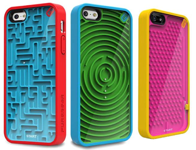
Probably one of the most interesting ideas out of the lot. This idea is based of a maze game which would make the frame interactive. So the design would be a 3D maze inside the frame, with a tiny ball that you would have to move about the navigate the maze. The target audience would be aimed at a younger generation or in some kind of gadget shop, as it's very different and you wouldn't see a posh person start playing with a frame like this. The only problem with this idea, would be time. 


The maze would be similar to this design.
This design would be similar to Mario, a tube running through the frame, which are linked together by the other frame. This design would be illustrated to appeal to a younger audience and even be in shops like Asos and Urban Outfitters.

Another one of my favourites. Each frame would contain parts of a clock. So with this idea I'm looking into how the frames would be visually as a set and not necessarily individual. The only problem with looking at frames from this perspective would be, it would only work if someone buys them all? Or if someone buy one of them, then the whole set could look odd. However the frames could be sold in a set and not individually sold to avoid this problem.

Wednesday, 3 December 2014

Studio Brief 1 - Development 2

Design 1

So before i transferred my shapes over into Photoshop, i decided to see what kind of typeface would work for this design. As my target audience would be aimed at the younger audience, so these frames would essentially be in shops like Topman, Urban Outfitters and Asos. Therefore any stylish/modern or edge San-serif would be fine for this audience. I wanted a typeface that would visually represent my collage style i was going to be creating. Looking through the different styles of typefaces and also referencing back to frames from Urban outfitters and Asos, I noticed a lot of them used a handwritten fonts, but not handwritten as in a elegant, over dramatic script typeface, but more subtle but edgy.


So this was the chosen typeface i decided to go with. The typeface was called Barrio and for me gave the perfect look and feel. So moving on from the typeface i then moved my shapes into Photoshop.

Once in Photoshop, i started to play around with shapes, colours and composition. I knew that i had full control to be as creative as i got possibly be and this was due to my target audience and the style i wanted to achieve. So this was my main goal, just to play around with what i had and see what i could come up with.


Also because i was designing photo frames, most of the designs i came up with on the spot and most was random, but i suppose that’s the beauty and fun with collages. I didn't feel like it was important to come up with a concept, which ever design decision had to have a reason. My decisions came from my imagination.


So playing around with having the design, landscape as well as portrait. I also experimented around with the type and seeing if i can make it a bit more noticeable.

Still playing around with composition, working with the blend modes and levels in Photoshop.


I added a border and tilted the border for the design to look more dynamic.

Playing around with colours.

Adding different textures in photoshop and applying opacity's and blend modes.

Working with Black and White, to isolate colours.

I then mocked up a version in a frame in photoshop to give me an idea of how it would look.

Frame 2


Just like the first design, the process was fairly similar. Create the shape in Illustration and then go on to modify it further in Photoshop.

Experimenting with all kinds of textures and materials in order to get the effect I'm looking for. Also It was important for me not to add to many colours by just keeping to one or two.

Using the same type layout as in the first design just to keep them recognisable throughout.


Experimenting with different colours
I decided to keep with the circles as a current theme throughout my designs. It's great to see where my influences came from and using selective colours contrasts extremely well with the black and white background.

Mocked up into a frame.

Design 3


As again, same process. This time i tried to avoid repeating my self but producing the same design as the other two, but at the same time still wanted it to link.

Kept with the newspaper material as it works great with the grid and gives of a natural authentic collage look. Also keeping the type the same.

What i started to do is, repeat the shape i had created in illustrator over and over again.

Once i added the circle, the design reminded me off Japan. Also all the shapes reminded me off a window cracking but in a abstract style.

Started to play around with lines, adding in lines to random parts of the shape, which i felt worked out very well.

Mocked up in a frame in Photoshop.

Also once i was happy with all my designs, i then save them as a background (without the text on them) and then placed them into Indesign where applied the text to the image. This assured my text to be clean with a high resolution. Type + Bitmap = Wrong. Type + Vector = Correct

Some screen shots of when i adding text in Indesign.