Saturday, 7 March 2015

Studio Brief 2 - The problem

The book I have been given to redesign the front of is "The Vignelli Canon" which has come with a lot of things to think about. The book is based around Vignelli design principles that he has applied throughout his life. His rules and guide lines are based around modern design aesthetics. However, when coming to the designing stage, this limits me to stick with what Vignelli has expressed in his book. So i wouldn't be able to design anything outside of this spectrum. Doing this would discredit Vignelli and contradict his book and career. The biggest problem is trying to come up with a unique concept, without it look similar to what the cover looks like now.

Hopefully i can take on board what Vignellis mentions about Appropriateness in his book "there are many ways of solving a problem, many ways of doing, but the relevant thing is that, no matter what, the solution must be appropriate. I think that we have to listen to what a thing wants to be, rather then contrive it in to an arbitrary confinement." I will try and apply these principles to this brief.

Studio Brief 1 - Brief

Studio Brief 01 - Design is About Doing 


Studio brief one is our very first live brief. The live brief is for a competition for Secret 7. What we have to do for Secret 7 is to choose one song out of 5 random songs. Once the track was chosen, we will have to then design 5 variations of Vinyl sleeves for that track. We will be competing against 1000s of people from across the globe and even well renowned designer such as Peter Saville, Jamie Reed and Annie Leibovitz. The main focus for the brief will be to focus on the visual semiotic and to try and connect and communicate with the track through it’s lyrics and rhythm.

Restrictions

As this brief was live, I knew there would be a few restrictions to take on board. Normally i would work with imagery, which are sometimes taking by me and sometimes not, However under the rules and regulations of secret 7, it stated that all work submitted must be your own work; therefore restricting my use of found imagery. Taking this into account this make me focus more on what i can do within illustrator, rather than taking my own photos to use. If i was going to consider taking my own photos the disadvantage of taking them is the amount of time i have to complete the brief plus good quality photos can be a challenge to capture.

Another restriction to look at is the best resolution for my final vinyl sleeve. The question is should i screen print or mono print? or is printing in general a bad idea? Printing may not be the reliable resolution due to the loss of quality once scanned and flatten into a digital copy. Again rules of secret 7, say that all the files must be entered digitally.

Mandatory requirements


The mandatory requirements will be the final resolution, uploaded and designed to Secret 7’s terms and conditions. Still producing and developing four designs, which i wouldn’t be submitting. Lastly, around a minimum of 30 design thumbnails.

Studio Brief 1 - Modern & contemporary design


Great use of colours, purple and red make the book visually pleasing and kind of make the two books uniformed. The block of shape is needed in order for the book to even stand a chance of being picked up in the book shop. The type is lacking potential. The typeface isn't as modern as it could be, but at least the designer isn't using a serif typeface. The layout of the title and authors name is a bit close to the edge of the book, therefore the type can be interfered with by the crease on the spine.

Even know this book is classed as modern, it has an awful stencil typeface. However, the illustrative circles at the bottom fits well with the message. The circles remind me of connect 4, but the title "Intruders" fits well with the circle, as most of the circles are the same colour but then there are the 'intruders' that have been applied in a different, stronger colour.

I absolutely love this book cover by Peter Benchley. The cover reminds me of the poster for Jaws. The use of typography is very subtle but extremely visually effective and creative. Very stripped back design, with not much happening, but just by looking at the colour and the letter "a" you can instantly grasp what book this is. Using the icon symbol of a sharks fin, this has been replicating using the "A" from the title. Using a Sharpe typeface also links in with the personality of a shark. Dangerous and not to be messed with. Everything else speaks for it's self. Blue would obviously will represent the water. However I'm not sure about the gradient? What is the grey meant to communicate? All it's saying to me is that the water is dirty. It possibly could of been used to show the darkness of the bottom of the ocean but there are other colour that would of been more complimentary like dark blue.


What instantly hits me with this design is the fantastic use of negative space. The book is about sex relating things and positions but having a cover like this makes the books seem romantic and very beautiful. The negative space between the black and white, draws away from the rawness and hard hitting visuals that may be slightly inappropriate for some audiences. Staying on the topic of the negative space, the black shapes interacting with the white, makes the silhouettes seems romantic, soft and look similar to heart shapes in some form. Maybe the typeface could of been lower caps. Lower caps would be perceived as soft and a bit more lovable which would link with the theme of the book. However uppercase could of been use to make it visible enough to stand out amongst the busyness.


Contemporary art has become more and more plain and simplistic over the years. This cover, I'm not sure what it communicates without looking further in to the content. This is the problem with a lot of contemporary books. The concept is often over looked over by visually pleasing design. With this all in the mind the book is still stylish and aesthetically pleasing.

Also with contemporary books, people are finding new way of playing around with the product it's self. So making new forms of books by making the front ad inside pages more connected and interactive.

Great example of what i was explaining in the previous book design. Making the book more interactive with the inside. You could even make a book where you might have 50 pages, but you wouldn't even need to open the book to understand the story line.


Studio Brief 3 - Book Cover Research

Book covers are the main reason why people will often buy or pick up books in the first place. Therefore the covers needs to be vibrant, visually appealing and for the message to quickly be communicates in an appropriate sense through visual awareness and semiotics.


Effective cover. Modern looking designs due to the typeface and the limitations of colour. Serif typeface in all caps. Having the type like this communicates strength and boldness, which represents the climbers on the mountain.Tilted typeface also plays in with the uphill struggle that every climber faces. Good use of space, with contrast of the blue for the figures and the sky.

First look at this book and what draws my attention is the blue and white bar, which reminds me of the loading bar you see on the Internet. Once my eyes lands on this feature, then i connect it with the title "Piracy" and i instantly think of Internet criminals who steals data online. However, i looked at the typeface, a serif font which wouldn't be an appropriate typeface to represent the digital aspect of piracy. I looked closely at the bar feature, and i saw the little boat near the end, which would mean, piracy in terms of pirates. Using the off white, yellow colour give the feel of a vintage, old fashioned look, which could give you a clue on the kind of content inside as it wouldn't necessarily be modern history of pirates.

Simplistic look and feel to 'The Lion, The Witch, and the wardrobe' book, compared to previous editions of book covers. Mostly all other additions are filled with expressive illustrations. However this book cover proves that you can still communicate the books content and feel with very minimal designs. Instead of illustrations this book cover has looked into making use of typography to represent symbolic meanings. The typeface at first glance looks a bit to decorative. However the decorative terminals could indeed represent the lion, witch and the wardrobe. The curve coming off the "Lion" could represent the lions tail. Same goes for the "witch" the curve can be perceived as a witches broomstick. Altogether the flow of the type effortless draws you from the top to the bottom and forms apart of the light.

I really like this cover. Not the design but the concept and meaning. The cover clarifies and gives you an understanding of what the book is about by only reading the title and looking at the imagery. The title suggest the book is about a relationship between two people and the roller coaster may seem really out of place and irrelevant. However it's not if you understand the common saying about a relationship being like a roller coaster, full of ups and downs. So the book communicates the good and bad times of a companionship. However, colour scheme isn't working in my opinions. I can see that the designer has probably used blue to represent the sky, so linking in with the image. Using blue type against a blue background is not appropriate for this kind of graphic design, book designs are meant to stand out and communicate everything in an eyes glance but how can it if its being blended in with the background.


What instantly hits me with this design is the fantastic use of negative space. The book is about sex relating things and positions but having a cover like this makes the books seem romantic and very beautiful. The negative space between the black and white, draws away from the rawness and hard hitting visuals that may be slightly inappropriate for some audiences. Staying on the topic of the negative space, the black shapes interacting with the white, makes the silhouettes seems romantic, soft and look similar to heart shapes in some form. Maybe the typeface could of been lower caps. Lower caps would be perceived as soft and a bit more lovable which would link with the theme of the book. However uppercase could of been use to make it visible enough to stand out amongst the busyness.

Instantly the use of the birds draw my to the title, as all the heads are directed and aiming at the title.  Colours are all complimenting each other well. For me without the birds directing my eye tot he title, it could be lost and overpowered by the amount of birds on the design.

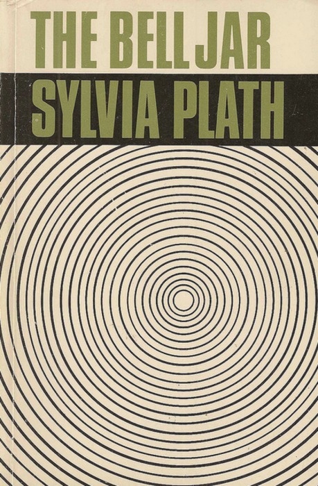
This design from Shirley Tucker is a well design and very captivating. The use of repetitive circles turn the design into some kind of illusion, drawing you in more and more the longer you stare at it. Great advantage to make the book stand out amongst the crowd. However the disadvantage with the book, is that your so focused on the circles that you kind of forget everything else. The title and and subtitle are irrelevant, but i suppose the use of big capitals serif typeface helps to try and refocus the user. 

I absolutely love this book cover by Peter Benchley. The cover reminds me of the poster for Jaws. The use of typography is very subtle but extremely visually effective and creative. Very stripped back design, with not much happening, but just by looking at the colour and the letter "a" you can instantly grasp what book this is. Using the icon symbol of a sharks fin, this has been replicating using the "A" from the title. Using a Sharpe typeface also links in with the personality of a shark. Dangerous and not to be messed with. Everything else speaks for it's self. Blue would obviously will represent the water. However I'm not sure about the gradient? What is the grey meant to communicate? All it's saying to me is that the water is dirty. It possibly could of been used to show the darkness of the bottom of the ocean but there are other colour that would of been more complimentary like dark blue.

The Holy Bible. This may be a hard book to talk about in terms of Graphic Design but ill give it ago. The aspect i love with the Holy bible is that it needs no introduction. The book is so iconic and recognisable throughout the world. Throughout time, the cover has never really changed.  Black cover conveys the message of subtly and respect, so the use of imagery on the cover would come across as inappropriate for the purpose of the book and could be seen as western influence which would cause unrest. The book needs to have a global appearance and stay unbiased by any culture in the world and any art movements. The typeface has always been serif. this was probably the case as the book was created over 2000 years ago. The font also comes across Gothic and has an influence to churches and religious typesets. In the conclusions the book is mundane and minimal, but it's fit for purpose, a sacred holy book which would never be ruined by modern design.

Studio Brief 2 - Visual Semiotics


The MacDonald's logo is an amazing example of a famous logo which needs no title or introduction. The logo doesn't have much meaning behind it. It's only because the restaurant is in millions of locations, so the logo is highly recognisable. I suppose that a different kind of visual semiotic has been used here. One side is being visual due to emotions, colours and composition behind a certain image/symbol and then the other side, where something is meaning full due to marketing and repetition being constantly chucked in your face.
Even though the origin of this symbol meaning is fortune, luck and well being but due to association with WW2 its now been stuck with a bias connotation. To most people looking upon this logo it will trigger hate and disgust with a little bit of fear. Something so small and simple can mean so much, which is what visual semiotics is all about.
The next 3 images will look into expressions as forms of visual semiotic. Happy, sad and angry are all produced by the human face but each expression has completely different meanings, which can trigger different feelings and emotion.


These illustrations sum up perfectly what I'm trying to show. As I said above each expression is perceived differently.  For example, by showing a sad expression, designers would also add designs features along side to emphasis the expression and to show the hurt and discomfort. Using blue suggest loneliness and coldness, while red would be linked to angry due to the association with red being hot, tempered and dangerous. The other obvious feature would just be the expression on the face. If we was analysing a real person, you can examine the eyes, frown lines, nose, eyebrows and lips, these are all emotion triggers. 
All these points i have mentioned above are essential to remember when designing my logo, especially if the logo will only be an icon only logo without type.

Studio brief 2 - Screen printing research.

With Brief two, our final resolution has to be screen printed in Vernon street. I've never done screen printing before, so there will be a lot of things i will need to think about. Paper thickness is important. According to Simon the thinnest gsm is around 50 and the thickest can really be as thick as you want it, so upwards to 500 gsm. The thinner the paper the more chance of the ink seeping through underneath.

Another aspect to think about is producing the positive and negatives. This process is extremely important to get right, if you don't produce this correctly then you could end up accidentally overlaying colours which you didn't want. Another area is line weights and sizes. Line weights should be thinner then 2pt and text shouldn't be lower then 8pt. Having type and lines to small could blotch the ink and ruin your design.

Ink's and paper colour are an important consideration, which hasn't really been covered. You have so many choices of ink styles from Neon, Gloss, Gold and even glow in the dark ink. All should be considered, as these inks can add an amazing touch and feel to the outcome instead of just using any bog standard colour.


Studio Brief 2 - Vignelli past work research

Before moving onto designing ideas for the book cover for Vignelli canon. I thought it'd be a good idea to look into his past work, which could spark and inspire ideas for this book. The cover for Vignelli Canon is very simplistic so I'm wondering if all his book covers are all the same modernist style based off the rules from Vignelli Canon.

Beautifully crafted book. Very contemporary and modern. The whole book has been embossed which means that no colours have been used, so the 3D embossed technique stands out, giving the book a contemporary feel. Here Vignelli uses his grid for the main feature of the book with the logo positioned within the grid to showcase how it functions.Very slick looking. Black backs up the contemporary feel and look. 

Another Simplistic design. A lot of space left on the page which gives more attention to the title. Serif typeface makes the book look powerful and very strong against the contrast of the black background. Very timeless design.

I would say this cover is more like Vignelli. Very large type and colour is most popular with Vignelli work. Large type gives the cover attention and readability. Vignelli expresses that primary colours are timeless and his right,. The red is vibrant and collaborates well with the white typeface. Maybe the typeface would be better in a sans-serif typeface instead of serif, it would look more natural and less awkward without the slabs interfering and demanding a lot of space. 

Set of book designs from Vignelli. His style of work here is very different from many other book designs which he has done. He doesn't normally use images that much on covers and he hasn't used any primary colours apart from the "89" however in Vignelli Canon, he talk about appropriateness within his design decisions and designing right for the concept and target audience. What ever Vignelli has design here, I'm certain he has taken on board the meaning of appropriateness and based his decisions around that.


Studio brief 1 - Research

As the brief was about album art, I thought it would be beneficial to look into different album covers as an art and concept/message. Questions to ask is what was the concept? is it successful? what medium have they used to capture and represent the message.


This cover design is pretty much all about girls. It's for the artist Blake Allen and is called girls. The designer has summed up the word girls perfectly. Typeface is a strong fashionable serif typeface. The font also reminds me of Vogue magazine. Background is a image of a woman, her hair takes up most space, which gives strength and readability to the typeface. In my opinion the hair being so big, can represent dominance and femininity. Altogether the design is powerful and fashionable.

Title of the song along with the author does not appear on the font cover. Does the concept or song title come through with out the title? The same aspect we have to consider within secret 7, as we aren't aloud the song title or author on the cover of the vinyl.  The design is obviously very busy, loud and with a lot of energy. I get the feel of an urban based artist with the graffiti. The design looks very post-modern and experimental. The target audience is probably young adults who are into indie/rock/house music. An artistic feel to the who concept also. The figure reminds me of daft punk but it could be anyone. The design is a good example of whats needed for albums to attract attention from the shelf. It's loudness will definitely stand out among the competition.

Knowing a few of Mika's songs from back in the day. Looking at this visually stunning artwork, sums up his personality and persona in an instant. Mika is very colourful so this artwork communicates the song and himself as an artist. The title "Life in a cartoon motion" is represented very well. Cartoon are illustration based, so the obvious medium and route the design had to take would be illustrations of cartoons. Colours are visually appealing and strong. Great attractive album which would attract the users eye. Title is bold and 3D, this is important due to the overload of illustrations in the background, the title needs to stand strong and this is achieved perfectly.

Amazing artwork for The Script. Two hands holding is centre of attention, which links strongly with the title. The hand holding can mean and represent a variety of things when you read the title "Science & faith". Science and faith are two subjects which a lot of the times conflict with each other. The hand gesture can represent the two areas coming together and recognising there differences. Colour and texture is not entirely clear what it's representing but it could represent the bond between two old enemy's of science and faith.

We came as Romans artwork demands the users attention straight of the bat. The serious glance from the man/woman in the gas mask attracts the users eyes and makes you question the message and meaning of the song. At first glance the cover reminds me of an Apocalyptic scene which just makes me want to listen to the song to find out and to see if there's an ulterior motive. The typeface looks old-fashioned and Gothic. The typeface links with the colour brown and the tea stained texture.
Peter Saville album artwork. Looking through his interview about this design, he gathered the idea from a floppy disk. The design is simplistic and has a direct, obvious link to a floppy disk. However the design is timeless and represents outdated side to technology.

Another design from Peter Saville. This design is also a great way to analysis from a screen printing point of view.  The design as a whole is very vibrant and simplistic.  Overlaying around 4-3 "o" to create multiple of colours and vibrant circles. Not sure really what the effect has to do with the title or artist. However, again the cover will stand strong amongst others on the music shelf. Title could be a bit bigger as it's fighting against the collateral of colours below and does get lost. However it works and Is visually appealing within the contemporary spectrum.


Thursday, 5 March 2015

Studio brief 1 - Final Design

This is my final design, which will be uploaded to Secret 7. This design is based around the sexual subtlety of Peter Gabriel Sledgehammer. Sledgehammers music video has a number of sexual references and sexual innuendos. The music video uses Play-Doh to subjectively ton down the weirdness and explicit scene of some sexual stuff. Taking the Play-Doh as the main inspiration. I wanted to sum up the weirdness of the whole video into one still image.

The hand gesture can be seen as a peace sign or a sexual reference (foreplay). Playing with 2 mind-sets will question the audience awareness and dirty mind, which is exactly what i was trying to achieve. The play-Doh emphasises the gesture and in a way glorifies it without making it to offensive, which Play-Doh does a great job of doing. Colour wise, I wanted the Play-Doh to be centre of the message. I increased the Hue to make the colour pop whist also adding vibrancy. The hand is slightly desaturated and so is the background, giving maximum attention to the Play-Doh.


Monday, 2 March 2015

Studio brief 2 - Final book cover

Below are my final 2 variation for my book cover. Its my final digital design before going onto screen printing it for the Leeds exhibition.


This is my final design in orange/red. Within the design, I applied a number of rules and techniques that Vignelli explains and follows within his book. The colour I've used is a primary colour, I’ve also used 2 colours effectively without complicating or compromising the simplistic, modern approach. Vignelli talks about Primary colours and how they are timeless. So taking this on board it only made sense to stick with a primary colours. Orange was used in the original but i found it to be the most appropriate when taking in mind visual appeal, attractiveness and modern principles. I've added in a subtle grid in the background. In Vignellis Canon, Vignelli talks about different grids he uses for different purposes and the grid above is the one he uses for book designs. Adding in the grid will link strongly and communicate how the layout works within a grid, which translates to the audience and gets across what kind of features and rules are implemented.

Typeface i used is Helvetica Bold. Reading through Vignellis Canon it was clear that i had to stick with one of Vignellis chosen 7. I needed to stick with modern principles, as modern design is what Vignellis is built upon. Out of the 7 there was two modern typefaces, Helvetica and Futura. I went with Helvetica, as it’s most recognisable and most timeless with modernism and Vignelli. Bold style was used in order to make the text more visually strong against the vibrant background. Arrow was implemented in order to connect with the users eye and direct them down on the text and eventually the title. Without the arrow the title may be lost and the users attention to distracted due to the title being small. Title is small but i feel like it maximises the effect of the tribute above, as I don't want to many distraction clashing with it. The layout of the title with the line above is also another layout technique used within Vignellis Canon.

Altogether I feel the design works effectively and visual communicates an appealing tribute to Vignellis life. Any reader looking at the cover will see the effortless and timeless designs in which the user can expect from the whole book. Before moving onto screen print, i will make sure the grid lines are thick enough and to make sure the title is big enough.

This is the black and white version to create a more of a special edition look. However i will screen print both versions but the above variation is a lot more effect due to primary colours and visual attractiveness.
This was the final Jacket. I used the same layout and design of which was on the front cover apart from the spine. I felt the spine needed contrast between the orange/red. The spine simply has the title of the book. The type is positioned small and to the right to stick with Vignellis aesthetics. Type colour is white to add balance from the front cover. Back cover has only authors name. The name is also positioned within Vignellis grid to add consistency from the front. It’s simple and modern and reflects the information on the actual book.

Studio Brief 2 - Vignelli Exibition

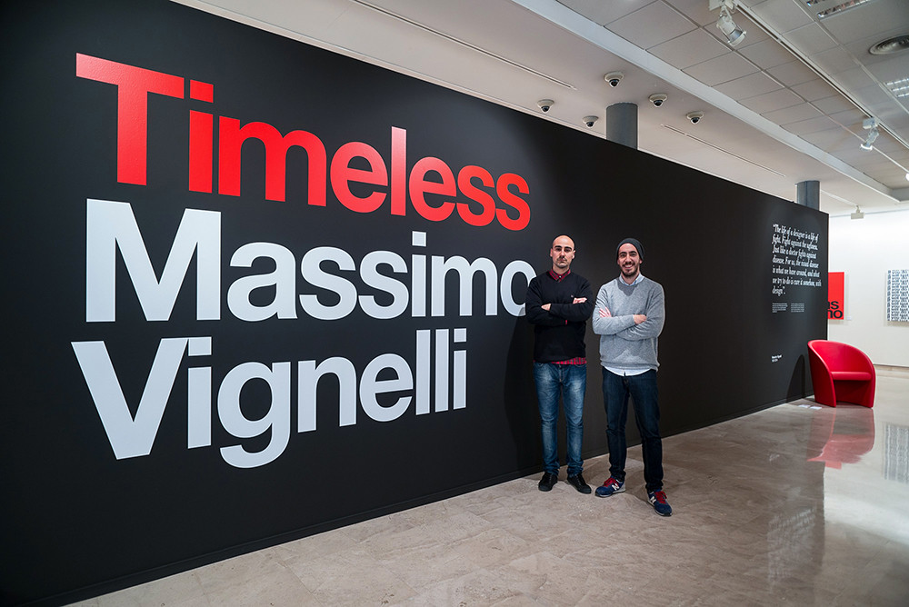
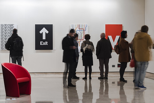
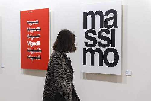
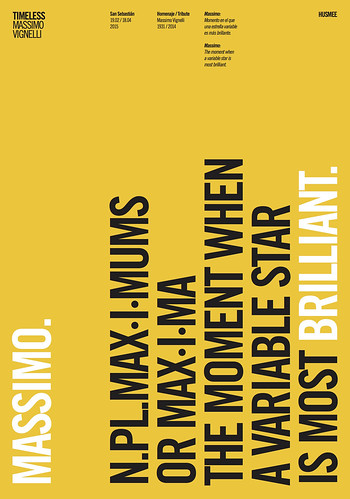
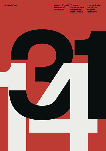
When i was researching about Vignellis death and if there was any memorial designs or tributes, i came across a blog post about a recent exhibition in Okendo Cultural Centre in San Sebastián, Spain, which celebrates the life and work of Massimo Vignelli. This was perfect for my research and gave me a glimpse at how designers from all over the world created posters which Incorporated rules, guide and techniques which made Vignelli one of the best designers off our time.


There was a lot of work displayed in the exhibition from brand guidelines, catalogues, stationary and furniture however the main work which took my interest were the tribute posters designed by more than 30 selected designers and design studios, including Alberto Corazón, Atlas, Javier Mariscal, Mucho and Toko


 A lot of the posters from the exhibition has inspired me a lot and got me thinking about how i can approach some more ideas, which will successfully take all that Vignelli offers by translating it with in a book design.

Studio Brief 2 - Mock up designs

Developing on from my initial ideas, I decided to mock up my favourite ideas, which gave the best concept and best represented Vignellis book.


Large 'V' and 'C' taking up most of the space on the page. Having large type will enhance awareness making it more visually from the book self. In Vignellis book his talks about large type becoming more then type. Large type may also become usable as an image, there I'm not worried if the letters are readable as it's all about the approach & message. Border at the top allows the title to stand out against the large type below without being over powered.

Same kind of approach to the above design. The different is the overlap of the 'V' and 'C' which is creating a positive and negative feel. Title of the book is much more subtle. I decided to make it more subtle to give the layout more space without it look cramped and clashing with the title. Also the more of a negative space you can achieve the more modern the whole design will look.

Very modern & contemporary approach to this design. Plain black background to communicate modern aesthetics. It may be hard to see but in the background is a subtle grid system which Vignelli uses to create most of his books. Title is small and subtle to enhance negative space which translate to most modern and simplistic aspects.

Overlapping of colours to maximise the 2 colour separations. Large type, very attractive colours. Good use of contrast. Thinking of going without the title in order to tease the user by seeing the dates and wondering what are they for.

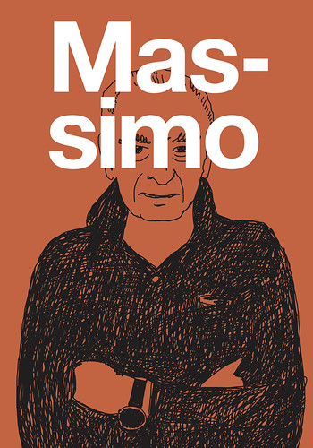
Using Vignelli dress sense to translate a modern approach. Vignelli blends in with the background due to him him wearing a lot of black. Design is meant to communicate a modern yet humorous approach. Like this idea but it may be difficult to reproduce this with scree print.

Another memorial design for Vignellis death. Number of his DOB and date he died are displayed within the grid system that Vignellis uses in his book. Arrow at the top of the page to direct users eye towards the bottom. Using gold for the letter to show the special edition, as gold is normally used with awards or specials editions. Small title just to emphasis and give the design above more room to shine.

Sunday, 1 March 2015

Studio Brief 1 - Final 5 ideas

Going through the developing stages of experimenting with different ideas along with marbling and Play-Doh, i have mocked up 5 finished designs for the interm crit.


This idea was for "sledgehammer". Simple but effective approach, working with subtlety with sex, I decided to communicate this message by what every man loves to boast about the most. His genitals! The design showcases 8 drawings of the biggest penises from the animal kingdom. Then at the bottom will be the sledgehammer, bigger than the rest with the hammer representing a penis and implying that 'mine is bigger then yours" attitude. I think the idea works, the design is a modern approach as the main message is the penises, so I wanted this feature center frame with no other conflicting noise.

This idea is for the reflection by The Supreams, using the recent experimentation with marbling. I chose to apply the marbling to this idea. At first i had to edit the marbling in Photoshop to bring out more energy and emotion that i wanted to capture about love. I increased the levels, brightness and saturation. The marbling represents the flow of a river and the reflection captured once the flow is disturbed. I used the colours of red & pink to link in the connection of love. Once changed to red and pink the design dramatically enhances and becomes aesthetically pleasing. All together this idea is the most eye capturing, which is needed when being displayed on a shelf.

However i had a few doubts. It may be the most attractive deign but it isn't necessary the most unique. Marbling has been done before many times over. If it isn't a unique concept then it wont be a strong contender. Also I'm not sure if the design clearly represents a river, as it may be mistaken for the Chemical brothers due the design looking more like a mixture of chemicals. I could use the colour blue to further strengthen the link to a river which should help the purpose.

The concept with this idea was to show the whole movement using a record player. The record player is half in the water with the reflection producing the other half, so I'm using the concept of water reflections to show the vinyl record as a tight link. The middle of the vinyl is also subtly representing the sun in some context. Using the feature of the sun shows the brighter side of life and love and was also implemented to help make sense of the water design. Still using the marbling, which adds depth and guarantees the record will be the focus point.

The use of colour also backs up my design decision about the focus point. The design uses a wide variety of blues. The most vibrant is within the disk to make is more important in terms of hierarchy. The more subtle blues are used for the sky & river but also complementing the inner circle. Blue is also used to represent water but may not represent love but more of a lonely approach.

This idea was based again around sexual subtlety and innuendos. The design as a whole is simplistic & modern. Simple but effective. At a glance the design is just a vinyl player. However at closer inspection the vinyl player is actually a breast with the vinyl arm as a sledgehammer. All the design features link with Peter Gabriel's song. I decided to go for an illustrative approach as the harshness of the breast would be perceived as more fun, excusable and approachable due to the breast looking like a cartoon breast of some nature. However if i had not used a cartoon looking breast and decided to go for a realistic breast then the design can come across as inappropriate, graphic and explicit.

Colours are effective and contrast well against the skin colour & the soft black background. I feel this idea is my best design which effectively communicates the concept in the simplest of formats. Every design shape, colour and feature is there for a reason & compliments every aspects on the page, which in effect strengthens the design concept and overall message.