Book covers are the main reason why people will often buy or pick up books in the first place. Therefore the covers needs to be vibrant, visually appealing and for the message to quickly be communicates in an appropriate sense through visual awareness and semiotics.
 |
| Effective cover. Modern looking designs due to the typeface and the limitations of colour. Serif typeface in all caps. Having the type like this communicates strength and boldness, which represents the climbers on the mountain.Tilted typeface also plays in with the uphill struggle that every climber faces. Good use of space, with contrast of the blue for the figures and the sky. |
 |
| First look at this book and what draws my attention is the blue and white bar, which reminds me of the loading bar you see on the Internet. Once my eyes lands on this feature, then i connect it with the title "Piracy" and i instantly think of Internet criminals who steals data online. However, i looked at the typeface, a serif font which wouldn't be an appropriate typeface to represent the digital aspect of piracy. I looked closely at the bar feature, and i saw the little boat near the end, which would mean, piracy in terms of pirates. Using the off white, yellow colour give the feel of a vintage, old fashioned look, which could give you a clue on the kind of content inside as it wouldn't necessarily be modern history of pirates. |
 |
| Simplistic look and feel to 'The Lion, The Witch, and the wardrobe' book, compared to previous editions of book covers. Mostly all other additions are filled with expressive illustrations. However this book cover proves that you can still communicate the books content and feel with very minimal designs. Instead of illustrations this book cover has looked into making use of typography to represent symbolic meanings. The typeface at first glance looks a bit to decorative. However the decorative terminals could indeed represent the lion, witch and the wardrobe. The curve coming off the "Lion" could represent the lions tail. Same goes for the "witch" the curve can be perceived as a witches broomstick. Altogether the flow of the type effortless draws you from the top to the bottom and forms apart of the light. |
 |
| I really like this cover. Not the design but the concept and meaning. The cover clarifies and gives you an understanding of what the book is about by only reading the title and looking at the imagery. The title suggest the book is about a relationship between two people and the roller coaster may seem really out of place and irrelevant. However it's not if you understand the common saying about a relationship being like a roller coaster, full of ups and downs. So the book communicates the good and bad times of a companionship. However, colour scheme isn't working in my opinions. I can see that the designer has probably used blue to represent the sky, so linking in with the image. Using blue type against a blue background is not appropriate for this kind of graphic design, book designs are meant to stand out and communicate everything in an eyes glance but how can it if its being blended in with the background. |
 |
| What instantly hits me with this design is the fantastic use of negative space. The book is about sex relating things and positions but having a cover like this makes the books seem romantic and very beautiful. The negative space between the black and white, draws away from the rawness and hard hitting visuals that may be slightly inappropriate for some audiences. Staying on the topic of the negative space, the black shapes interacting with the white, makes the silhouettes seems romantic, soft and look similar to heart shapes in some form. Maybe the typeface could of been lower caps. Lower caps would be perceived as soft and a bit more lovable which would link with the theme of the book. However uppercase could of been use to make it visible enough to stand out amongst the busyness. |
 |
| Instantly the use of the birds draw my to the title, as all the heads are directed and aiming at the title. Colours are all complimenting each other well. For me without the birds directing my eye tot he title, it could be lost and overpowered by the amount of birds on the design. |
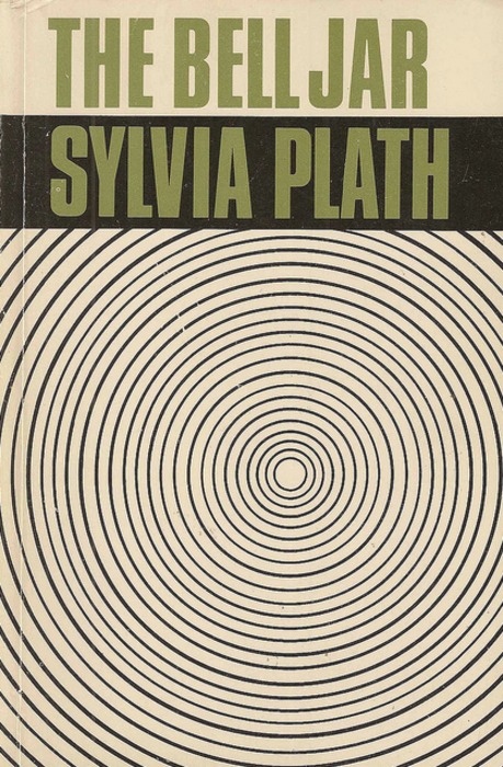 |
| This design from Shirley Tucker is a well design and very captivating. The use of repetitive circles turn the design into some kind of illusion, drawing you in more and more the longer you stare at it. Great advantage to make the book stand out amongst the crowd. However the disadvantage with the book, is that your so focused on the circles that you kind of forget everything else. The title and and subtitle are irrelevant, but i suppose the use of big capitals serif typeface helps to try and refocus the user. |
 |
| I absolutely love this book cover by Peter Benchley. The cover reminds me of the poster for Jaws. The use of typography is very subtle but extremely visually effective and creative. Very stripped back design, with not much happening, but just by looking at the colour and the letter "a" you can instantly grasp what book this is. Using the icon symbol of a sharks fin, this has been replicating using the "A" from the title. Using a Sharpe typeface also links in with the personality of a shark. Dangerous and not to be messed with. Everything else speaks for it's self. Blue would obviously will represent the water. However I'm not sure about the gradient? What is the grey meant to communicate? All it's saying to me is that the water is dirty. It possibly could of been used to show the darkness of the bottom of the ocean but there are other colour that would of been more complimentary like dark blue. |
 |
| The Holy Bible. This may be a hard book to talk about in terms of Graphic Design but ill give it ago. The aspect i love with the Holy bible is that it needs no introduction. The book is so iconic and recognisable throughout the world. Throughout time, the cover has never really changed. Black cover conveys the message of subtly and respect, so the use of imagery on the cover would come across as inappropriate for the purpose of the book and could be seen as western influence which would cause unrest. The book needs to have a global appearance and stay unbiased by any culture in the world and any art movements. The typeface has always been serif. this was probably the case as the book was created over 2000 years ago. The font also comes across Gothic and has an influence to churches and religious typesets. In the conclusions the book is mundane and minimal, but it's fit for purpose, a sacred holy book which would never be ruined by modern design. |
No comments:
Post a Comment