Looking more in-depth with the logo for Hardshell labs, I thought about the target audience of which the logo would be aimed at. There are a lot of areas that Hardshell labs could be aimed at like technology, gaming industry, environmental, nature reservist. However the main objective of Hardshell labs is to protect the desert tortoise, therefore, i decided to look at logos which have a link to national park logos and other nature looking logo's that protect animals and nature.
 |
| National park in Colorado. The logo is visually strong and conveys a modern take on a national park logo. Colour wise, the logo still uses green but more of a contemporary bluey green and not necessarily a strong green. However the colour still represents nature. The animal within the logo justifies the colour as without the animal then maybe the wildlife aspect may be lost. The typography is visually strong. The serif typeface bring the font to the forefront and keeps the logo from getting lost from the background of the logo. |
 |
| Nature Valley logo. The shape used for the logo is typical for all logos in this subject area. The main reason for this is that the logo can have more detail within the shape. Even though the more detail you put in the logo the harder it might be to visually make sense of it. However these kinds of logos are made to show the beauty of the area they are representing. Also these type of logos are never normally shown small. The logo is mainly shown on t shirts and other clothing, making full use of the beauty constructed logo. Green has been used to represent nature and wildlife, which is the main aspect that similar companies want to show. The typeface is a bit different for this logo. It looks like it has been hand crafted/drawn. It can be seen as someone who has carved letters onto a tree. Making that link to an nature reserve that one bit stronger. |
 |
| Similar to the previous logos above. However this logo looks to be slightly outdated and has Incorporated a lot of detail within the circular shape. |
I then started to look at other examples of logo that have Incorporated the tortoise as the main focus point.
 |
| Simplistic take on the tortoise. Secure credit look like it's a company that simply secures it's customers credit information. Tortoises are known for the secure, strong, durable shell. Therefore the company is representing these properties to showcase the reliability of the company who will be protecting their customers important information. |
 |
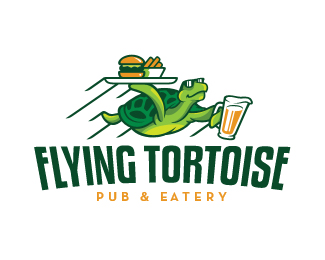
This logo is bold, visually strong and contemporary. To be honest this logo could even just use the icon and not include the text. The icon pretty much sums up the company name. This would make the symbol conceptually strong, which will represent the company. By using useful branding strategy then the company could turn the symbol into something that is recognisable within an instance.
However the typography is still impactful and also represents something that is flying almost. By distorting and bending the type it makes it look like it is bending in the wind, flexing and waving. |
 |
| This logo is a strong indication of using the tortoise shell as the main focus point for the company. Again like the previous logo, the company is about defence and using the tortoise shell to clearly represent this security. Overall it makes the company seem reliable, strong and trustworthy. The shell is larger then average, dominating the overall look and the hexagon pattern used for the shell can also represent a link. Link of patterns combining and further communication the concept of strength. |


No comments:
Post a Comment