Thursday, 19 May 2016

Studio Brief 2 - Music ADD VIDEO CAN POST

Music in games make the whole experience more memorable and interactive. Every single movie trailer incorporate music within it to capture the dramatic effect and appeal to the emotions of the viewers depending on the genera of music. Music is a way to emphasis or make sense of what's happening, giving the user a clear indication of what's happening in the game, it can also be used to strengthen a certain agenda the game subtle embeds. 8 bit music in general is very simple to produce and is very distinctive to the ear as it’s mostly used for games. 8 bit music is well known for it's comical and cartoonish sound effects and this is the kind of style I was looking for when animating the first level of 'Trumpft Whitehouse race', a style that combined with the graphics gives the underlying message more strength and context.

The biggest challenge was to figure out the theme song that runs throughout the whole level. It needed to be a song that insults and mocks Trump opinions and policies but in a way that was subtle to the Trump supporters but was obvious to others. It would be a clever and funny epiphany moment for people against Trump.  Many songs were suggested such as the American anthem, which was on the correct pathway but it needed more of a clever context behind it. In the end the chosen background theme song was the Mexican anthem. Trump has continuously insulted and disrespected Mexico by suggesting that they bring rapist and drugs to the US and has vowed to build a wall around the border. Therefore, the best way to mock these policies was to use the anthem throughout the whole game. The song was converted into a 8 bit style to match the overriding 8 bit theme and the anthem was slightly sped up to avoid making it completely obvious that it's the Mexican anthem and also with it sped up it's ads more of an energetic feel to the game.

All of the other music/sound effects have been used to add a cartoonish feel to the game. This gave the game a fun, engaging and interactive sentiment to the level. It's another way to further disrupted Trumps image of being portrayed in a professional way and further increase the possibility that people will see him as a stupid and comical personality then a serious presidential candidate.


Lastly, music also offers as a promotional material. Music can be heard by all and therefore will spark peoples attention if someone plays the game on the train, bus or wherever they might be. Incorporating fast pace and energetic 8 bit music will catch peoples interest making them want to catch a glimpse of the game the user is playing. 

The music can be heard in the video below:


Comp 1_8 from Jack Solomon on Vimeo.

Module Evaluation

Overall, the module has been challenging but one of the best module since coming to university. From the start it was difficult to get started on this project due to other module needing more attention and focus. The decline for other modules were very close together that stumped my full attention and progress. The main benefit was figuring out the concept and rationale before starting brief 1 and 2. Even though I didn’t start any of the briefs I had a good understanding off what I wanted to do. It was good in terms of preparation as it saved me a considerable amount of time for when I had the time to finally work on it.
The main reason I enjoyed this brief was the flexibility and the openers of the both briefs. The brief didn’t restrict us in any manner as it was left up to us. The amount of openness aloud me to work on certain topics that I’m currently into and find exciting. The Bauhaus movement was an obvious choice as my chosen topic area for brief 1. I had used Bauhaus for inspiration for a number of briefs this year and through that had gained a lot of appreciation for the movement — so to focus curly on the movement for the banknotes filled me with excitement and drive which made the whole brief thoroughly enjoyment. As I was enjoying brief 1 so much I made effective use of research, normally I wouldn’t find research very interesting to do and often saw it as a burden but because the I was interesting in the subject, research become an opportunity to understand the movement further. At some situations I ended up researching the movement personally for my own enjoyment which shows my fascination. 


Brief 2 was such a fun brief. Picking a political subject around Donald trump allowed for me to fully attack and insult Donald Trump for the disgusting man his was. His views, comments and policies are all very dangerous and damaging to the America if Donald trump was to become president in 2017. It was clear from the onset that producing a digital resolution for this brief was obvious. It was the area of graphic that I loved and enjoyment the most. Ux/Ui, two subjects that bring out my passion and drive to make a resolution that excels and demonstrates my commitment to Graphic design. I ended up revisiting existing skills from responsive in which I learnt from working on the User experience and user interface briefs. After effect was the main skill I eating to improve within. After effects, a software that I began to learn in responsive and since then I felt as if  the software opened me up to a lot of opportunities that before has restricted me to take digital design to the next level. It allowed me to produce resolutions that were more interactive and more visual to present. Overall, I feel what I had produced for this module is something I can be proud off, work that I can use as strong portfolio pieces, that demonstrates the passion I have for digital design as well as the current fascination with the Bauhaus.

Studio Brief 2 - Evaluation CAN POST

Brief 2 was a perfect opportunity to apply my existing skills and apply them for a political cause. I knew from the start the kind of approach I wanted to take. I’ve found the area of graphics that I’m most interested in which is the field of UX/UI but digital design in general. In the responsive module I only picked digital briefs that incorporated user experience and interface design. I absolutely loved every minute of it so it was an obvious choice that what ever political issue I chose to base the brief around I wanted to create a digital resolution for.  

The topic area I decided to choose was Donald Trump. Trump’s policies and comments have been extremely controversial. Even though he continues to make outrageous statements that are full of hate he still dominates the poll and is in the perfect position to win the presidential spot. With Trump being constantly in the media there has already been a vast amount of parody mocking Donald Trump for his mindset and apperance. I wanted to create a resolution that exposed Trump through political satire and humour. 

Creating an 8 bit game felt the most appropriate method to create a parody of Trumps views and apperance while taking full advantage of my area of interest. Through creating the game I was able to apply existing skills to the game. After effects, a software that I began to learn in responsive and since then I felt as if  the software opened me up to a lot of opportunities that before has restricted me to take digital design to the next level. It allowed me to produce resolutions that were more interactive and more visual to present. I applied my existing skills to the game and from that managed to create one level that was fully animated. The game gave me a perfect opportunity to play around and experiment with humour and political satire that insulting and ironically turned Trumps policies against him. Through experimenting the game was a perfect platform to see how far I could take things. Implementing key components of Trump such as the Pope, Mexicans and ISIS the game started to become an eye opening platform which subtly mocked and insulted Trump and his loyal thick supporters. Along with the game, the campaign collateral strengthened the message of the game and it was a way to appeal to a bigger viewer ship to get more people excited and to create a sense of hype through social media and the implementation of hashtags.

Overall, I wish I had more time on this brief, I would’ve like to animate a few more levels but because of the time limit I wasn’t able to achieve this. But hopefully over summer I will animate the majority of the game and see where I can take the game. 

Studio Brief 1 - Evaluation CAN POST

Brief 1 was an exciting opportunity to come back to screen print, a skill in which I partially forget and lacked the knowledge within. The most challenging aspect of this brief was the limited amount of time we had to get our banknotes screen printed. We were set a deadline to screen print our money but due the back log of work from context of practice and the deadline rapidly approaching the focus was put on completing that module to a high standard instead of on my banknotes. Therefore, I only had a week to screen print my money before the deadline.

Even though some people didn’t finish their briefs to the original deadline they were still given an extra 2 or 3 weeks to finish their money. I could’ve used extra couple of weeks to work on my money and possibly end up with a better design overall but Its beneficial and productive to work towards a deadline. The tight deadlines are in place to prepare us as young creatives for how the industry will work. If people can’t stick to the deadlines then they will only struggle once they go into full time employment. The screen printing process was difficult at first but eventually I managed to successfully produce a set of three bank notes. Even though the bank notes had to be simplified in order to print them on time, overall, the bank notes still communicated the three disciplines of the Bauhaus movement by using the famous geometric shapes of Bauhaus. 

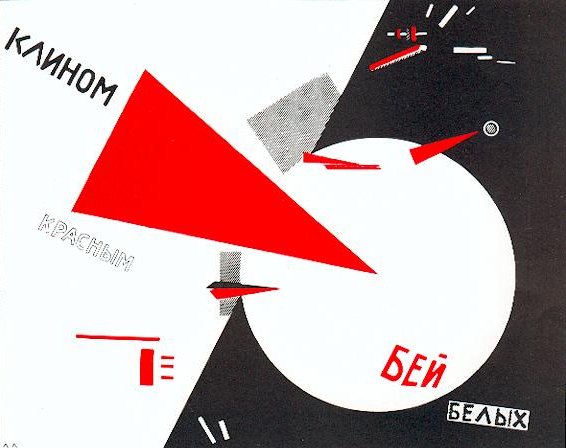
The development of the bank notes made use of the research process by investigating and understanding the key pioneers of Bauhaus movement throughout the years such as Marcel Breuer, Marianne Brandt and important people who influence the movement such as El Lissitzky with his icon ‘Beat the Whites with the Red Wedge’ . By researching influential figures it took my bank notes down a contextual route, making the concept of the series stronger.  It was also vital to understand money in the first place, through research I understood money as a concept and how it played an important part globally. Understanding traditional money and how the rise of bitcoin and contactless could potentially start to see the disappearance of money as we know it. Who knows if money will survive but because of the risk of hacking money will be still be around purely for the security aspect.

Overall, I felt that I could’ve worked harder on this brief but as I’ve already mentioned It began a challenge to balance work when other deadlines where approaching. I also knew that brief 2 was a bigger brief then brief 1 I also ended up spending more time on brief 2. 

Wednesday, 18 May 2016

Studio Brief 2 - Initial sketches

As I'm more informed about the type of game I'm hoping to create. Below are a few game ideas for 'Trumps White House Race' that will aim to subtly insult and mock Donald Trump and his supporters.

The first game idea is based around Donald Trump’s hair and the recent news story about a plant that grows on a beach that resembles his hair. The first level will see the user navigating Trump down a beach to collect his bleach blonde wigs that have been growing there. The user must successfully collect the required amount without being killed by immigrants and the incoming tide. Other items the user can collect on the way are hairspray, fake tan, guns and cash. All these components are essentially designed to insult Trump but in a subtle way. The majority of the users playing the game will mostly be Trump supporters so even though they know that they have to collect his wigs they still would want to invest into the game because they want to see Trump succeed and as president so they would glance over the subtle insults as to much of a distraction.


The next game idea is what every Trump supporter would love to play. Essentially, the user would have to fend of the incoming attack from the Mexicans who are trying to kill Trump. This game incorporates Trump's views on Mexicans and his views on gun laws. By having the Mexicans attempting to attack Trump would certainly be seen as an incentive for Trump supporters to play the game to kill the Mexicans as they would share the same hatred as Trump.


This game is a subtle hint as one comment Trump made about his daughter. He expressed that If his daughter wasn't his daughter then he would date her. This statement is clearly weird and incestual. This incestual approach would be embedded within the game’s environment. The narrative of the game would be that Donald has left the key to the white house in Ivanka's bed and he needs to retrieve it without the paparazzi spotting him. Therefore, the user has to navigate Trump through the different floors while hiding in dark places around the house to avoid being seen by the paparazzi. The message behind the game showcases that Trump has slept with his daughter and left the key in the bed but the game doesn't actually confirm this therefore making it not as apparently for everyone so it can still be enjoyed by Trump supporters.


The last game idea is set within a factory environment and the message behind the game is about fascism to create a pure American race. Essentially there will be a conveyer belt in a factory that starts of as crap which then goes through the ‘American machine’ and converts the crap into a Donald Trump supporter. If the supporter is to dark then the user will have to send it to a fiery death but if white enough then the supporter can live. The user will have to decide within a short time limit whether the supporter will live or die in order to complete the game. Hopefully the insult and mockery isn't to noticeable with this game. If the poop turned into Donald Trump's then maybe it will be too obvious but because its supporters instead it may not click straight away and because the machine will continuously speed up the user won't have much time to really focus on what's actually happening.


Studio Brief 2 - Future of Game / Brand CAN POST

The future of the game will only last as long as the presidential election. The game is called 'Trumpft's Whitehouse Race' and is about navigating Trump through many challenged in order to make it to the Whitehouse as president. Its evident to see that the game will only have a life span for as long as the presidential race lasts. The presidential race ends in 2017, therefore the game will only have in till then to engage and build a community of gamer before the game becomes irrelevant and people move on with other contemporary games, only leaving behind the loyal fans of the game.

The end is short but strategies can be embedded to make the success last longer, avoiding a total end. Over the course of Trumps game the company would build a reputation of some sort, if the game is good then people will come back and vice versa. If people like the game and notices that the company has brung out another 8 bit game coming out then they wouldn't hesitate to move onto that game because of the high standards the had with the Trumpft's Whitehouse race.


Brand
If this becomes achieved then the company ends up becoming brand. A brand that can expand and make more games based on subjects such as political humour or games that the community want to see. Through merchandise the brand can build a following and community, selling t-shirts, posters and other merch will increase visibility off the brand. It acts as a form of free promotion while also turning over a substantial income. Another way to build profit would be to charge people for the game, but as a relatively new company, loyalty from the audience is crucial if the brand want to succeed. Another idea would be to make the game free and instead make a profit by advertising on the actual game. It an advantage for both customer and brand. However, if the brand uncaringly place ads all over the game then the user experience, user journey and aesthetics of the game would suffer. The adverts may interfere with the game play, which can cause people to seek out other games that don't implement annoying ads. The last option would be from the selling of merchandise. You can make the game(s) free of charge to download but you can bump up the price of the merch for the brand to make a profit of some kind.

Studio Brief 2 - Primary Research / Would you buy this game? CAN POST

As most of my final resolutions have been complete I was time to actually see if the concept was achieved. In this bit of research I used the final animation of the 'beach level' to based the research off. I asked around 7 people (i think) and asked them "Is this a game that you would buy?" and "Do you understand the concept?".  The best answer were: (I forgot to write the answers down, so I've tried my best to remember the answers)

"I love it! It's so good, well done!"
"Yes absolutely I can absolutely see it on the app store"
"It's meant to be a game that takes the piss out of Donald Trump"
"How did you do that?? "
"You've done really well to insult Trump, the Hitler references are clever"
"Very unique approach ,  I love how you've centered a whole game around Donald Trumps hair"
"It looks really professionally done"


From this feedback its clear that what I've set out to achieve has been successful. Everyone said they would buy the game and some said that they would download it right now if they could. They understood the humour and some people even laughed at the short animation of the 'beach level' -- this was a proud moment for me as I worked extremely hard on the game and to see the concept being understood and appreciated was nice to see.

The goal was to mock Trump for his backwards idea and policies and to use a range of humour from sarcasm, irony and satire to insult Trump. The result clearly demonstrate the success of the concept and game.

Studio Brief 2 - Primary Research / What Do People Hate About Trump CAN POST

To help me come up with a some ideas of how people portray Trump,  the best option would be to ask people in the class about what they hate about Donald Trump. From this research I can start to filter the results and come up with a few ideas of how I could insult Trump within the game and what I can do in order to mock and subtly insult him and his supports. Essential, using the things that people hate and turning it into against him. 

I asked around 20 people to give me three things they hate about Trump. The list is long but these were the answers:

  • Personality
  • Hair
  • Taking up precious oxygen
  • Racism
  • Bigotry
  • Sexism
  • the way he talks
  • Hatred against muslims
  • the fact that he is breathing (harsh)
  • manners
  • policies
  • smell
  • His annoying face
  • His name
Out of all these different points the 18/20 people said policies. With nearly the majority of girls I asked said about his sexism against women. All the other answer were relatively average. All these answer clearly demonstrate the dislike against Trump. When I asked the question of "What do you hate about Donald Trump?" no one hesitated to express their hatred towards the man and no one said "who is Donald Trump?" or "I don't mind him". His controversial policies have made world news and its clear to see that a lot of people don't agree with him. I will digest these answers and see how I can use them to turn them against him with sarcasm and political satire.

Studio Brief 1 - Primary Research / Show Me The Money Exhibition CAN POST

Today we went to the Show me the money exhibition based in Manchester. "This exhibition asks: what does ‘the market’ look like? What does money really stand for? How can the abstractions of high finance be made visible? Who is finance for? The exhibition charts how the financial world has been imagined in art, illustration, photography and other visual media over the last three centuries in Britain and the United States. " 

The exhibition portrays money in a contextual manner showing money within the last three centuries. The exhibition showcased an array of mediums from Paintings, photography, video and instruments of foreign exchange. Through out the exhibition the majority of the money is based about politics and how money breaks the social and and class boundaries. Money is the route to powers and a lot fo the propaganda posters in the exhibition demonstrates this point.


Studio Brief 1 - Post-Screen Print Feedback

A couple of days before screen printing I had a few issues with my design. What I wanted to screen print was going to be at least 6 colour separation. 7 colours is a massive challenge as I only had a week till the deadline. Within this in mind I needed some help to decide how I can combat this issue. I asked Simon about this issue and he suggested that I could either find other alternative ways to print the design without screen printing or combine a number of methods to achieve the detailed design.

Simon also suggested that I could even simplify the design. Take away the visuals and only have the geometric shapes for the sake of the exhibition. It was a hard decision, I looked into Lino and mono printing and to be honest they didn't seem very engaging and exciting as screen printing. My only rule within each project is to make sure I'm enjoying what I'm doing and Lino and mono printing isn't my idea of enjoyment as previous experiences have told me.

In the end I decided to simplify the designs and screen print them. The biggest issue with this is the concept. I wasn't sure if the concept was going to become lost or confusing. Will people be able to understand what the notes represent? The only way to get over this problems is with an effective description of my bank notes within the exhibition.

Studio Brief 1 - Feedback with Simon CAN POST

Before I began to screen print my work I wanted to ask for feedback about my designs. I showed my notes to Simon and explain the concept and each features that communicated a contextual and modernist approach. He expressed that what I had produced was clearly conceptual with a lot of thought being put in the notes. The one bit of important feedback simon gave me was about the German anthem I had implemented on all notes. He suggested that I should try and use the a section of the Bauhaus manifesto instead. The manifesto would relate more to the celebration of Bauhaus and in a way educating others about what they believe in. Even for German who don't know who or what the Bauhaus movement was about they can read the small passage from the manifesto and begin to understand modernist design along with all the pioneering revolutionary designs and products that have come out of the movement.

Below is the manifesto in full. I could essentially use a lot in the manifesto as most of it reflects and celebrate all disciplines as a unity.

“The ultimate goal of all art is the building! The ornamentation of the building was once the main purpose of the visual arts, and they were considered indispensable parts of the great building. Today, they exist in complacent isolation, from which they can only be salvaged by the purposeful and cooperative endeavours of all artisans. Architects, painters and sculptors must learn a new way of seeing and understanding the composite character of the building, both as a totality and in terms of its parts. Their work will then re-imbue itself with the spirit of architecture, which it lost in salon art.
The art schools of old were incapable of producing this unity – and how could they, for art may not be taught. They must return to the workshop. This world of mere drawing and painting of draughtsmen and applied artists must at long last become a world that builds. When a young person who senses within himself a love for creative endeavour begins his career, as in the past, by learning a trade, the unproductive “artist” will no longer be condemned to the imperfect practice of art because his skill is now preserved in craftsmanship, where he may achieve excellence.
Architects, sculptors, painters – we all must return to craftsmanship! For there is no such thing as “art by profession”. There is no essential difference between the artist and the artisan. The artist is an exalted artisan. Merciful heaven, in rare moments of illumination beyond man’s will, may allow art to blossom from the work of his hand, but the foundations of proficiency are indispensable to every artist. This is the original source of creative design.
So let us therefore create a new guild of craftsmen, free of the divisive class pretensions that endeavoured to raise a prideful barrier between craftsmen and artists! Let us strive for, conceive and create the new building of the future that will unite every discipline, architecture and sculpture and painting, and which will one day rise heavenwards from the million hands of craftsmen as a clear symbol of a new belief to come."

Studio Brief 2 - Social Media CAN POST

Social media will be used along side the other campaign collateral to boost awareness and to build an online presence that will get people talking and engaging with the campaign. Through social media the game has the opportunity to interact with its fans and to get their feedback on the game. To understand their thoughts and opinions, it can be a place where people share their own gameplay footage and create viral videos of the back of them. With the game being very humorous and satirical the game would be able to gain a lot of attention in the run up to the presidential elections. Fans could share the funny gameplay footage to their friends who would essentially share it with their other friends. The game can also work in collaboration with well known Youtube personality who's job it is to make videos playing games. Youtube personalities such as Pwedipie, Syndicate Project are only a few gameplay personalities who has an audience of millions.

Social media is a great place for free promotion. Through Twitter and Facebook the game has the opportunity to trend. Trending will essentially boost exposure by getting everyone talking about the game and essentially will create free exposure as friends share it with their followers and so on. To get the game trending advertising strategies will have to be implemented within social media by the use of hashtags and with a strong campaign. Its all about creating hype and awareness of the game. 


To get the game trending we would use the hashtag #OurFuhrer. This will allow people to voice their opinions and thoughts about Donald Trump. The hashtag becomes essential as it's the first part of the sentence, therefore the hashtag is as important and isn’t seen as an annoyance that needs to be added on at the end. 'Our Fuhrer' means 'our leader' and this phrase is most associated with Adolf Hitler. It subtly insults Trump but is still misleading to his supporter because if they aren't well educated they would see the hashtag as our leader and they would take that as promotional for Trump.


Studio Brief 1 - Other design Variations/future CAN POST

Below are the other variations that didn't quite make it in the final resolution but they all demonstrate other revolutionary individuals from the Bauhaus school. All three shapes still represent product design, Graphics design and architecture but the final versions work better in terms of layout and aesthetics. 

Future of the notes

However, in the future other variations like the ones below can be used to continue the celebration of revolutionary products/design and even other disciplines such as pottery, sculpture and art.  Essentially, every couple of months or even years the design can switch to other important pieces of work to celebrate the individual. It keep the concept exciting long into the future and its a chance to pay tribute to all of the greats from the Bauhaus movement.


Studio Brief 1 - Original Bauhaus Bank Note CAN POST

Due to heavy economic problems after the first world war, Germany found itself in an "Hyperinflation" from 1922-1923. Up until 1923 the value of the Mark rapidly sunk further and new money in higher denomination were issued to deal with the inflation. Germanys bank could no longer cope with the inflation. New denomination of notes ranging from thousands, millions and billions of Marks were issued to keep up with the downfall.


As the Mark began to collapse, Herbert Bayer was called upon to design a series of emergency money for the region of Thuringia incase of economy collapse, only 2 years after he enrolled at the school of Bauhaus. Modernist in its approach Bayer implemented the style of Bauhaus that was geometric, minimal and functional. The modern notes were a complete disregard for the traditional notes of the German mark at that time -- often full of serifs, national symbols, emblems and elegance. It removes any sign of German nationalism and patriotism but instead embeds the clear principles of modernist design and the Bauhaus style.


The bank notes incorporates Bayer's own typeface 'Universum' to reflect a clean and modern aesthetics of Bauhaus. The bank note is functional for its purpose, colour coded to ease communicate with the only non-modern feature on the note is the crest of the Weimar Republic, its sole purpose is to serve as the official seal, giving legitimacy and security to the banknote. 


Studio Brief 1 - Bauhaus Influences CAN POST

To understand and celebrate the Bauhaus movement it's important to distinguish the most influential figures of the movement. Not just people who were apart of the movement but the revolutionary pioneers that reimagined the world around us by producing products, design or art that is still influential today.

Below are a few examples of the most influential individuals that came out of the movement.


Marcel Breuer


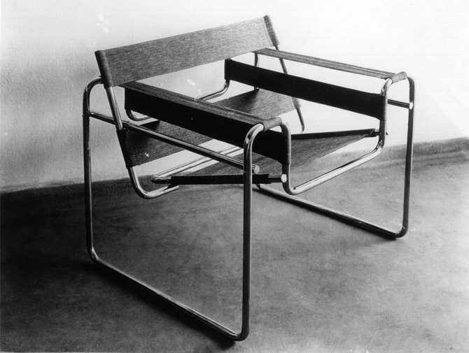
The Wassily chair (model B3) was designed by Marcel Breuer in 1925-26.  Marcel Bruer position at the school was head of the cabinet-making workshop. The chair become revolutionary for it's bent steel and canvas along with manufacturing. Breuer was also celebrated for his achievements in other areas such as architecture and furniture.


El-lissitzky

Considered symbolic of the Russian civil war, the Beat the Whites with the Red Wedge was designed in 1919 by El-lissitzky. The poster is an example of constructivism and symbolises the bolsheviks, who are penetrating and defeating their opponents, the opponents being the White movement.


Ludwig mies van der rohe

Ludwig life goal was to create a contemporary architectural language that could embody the new start of technology and production. His architectural building are executed as objects of what could be considers beauty and craftsmanship by many but when viewed in person the building can seem simplistic and direct. His work has attracted many modern philosophers and theoretical thinkers to continue his work by exploring and speculating his architecture.


Marianne brandt

Marianne Brandt position in Bauhaus was head of the metal workshop which she obtained in 1928. Marianne Brandt designed many product in her time at the school. From ashtrays, lamps and kettles many of which are recognised among the best of the weimar and Dessau Bauhaus. In the 21st century Marianne's designs are considered the 'harbinger' of modern industrial design.


Christian dell

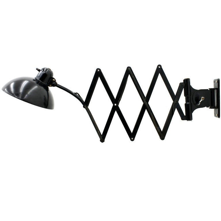
From 1922-25 Dell worked as a foreman of the metal workshop at Bauhaus at was behind a innovative and pioneering style of plastic design. Dell's was mostly reconsider for the table lamp model 6631 Luxus, which became KAISER idell top model. In the 21st century the lamps are considered a symbol of Germanic design, with it's precise engineering and impeccable choice of materials. 


Tuesday, 17 May 2016

Studio Brief 1 - Final Bank Notes

Below are the two finished resolutions for the German bank notes that celebrate the Bauhaus movement.  The first three are with visuals and the other three are the stripped versions that I ended up choosing to screen print. The overall aesthetics of the notes communicates a contemporary and modernist style with heavy influence from the Bauhaus school. The majority off the notes relates to the Bauhaus movement, which demonstrates a contextual and well thought out banknote. It's timeless aesthetic expresses the famous principle of form follows function. The banknotes are stripped of all unwanted features. Therefore, you are only left with the bare essentials which is enough for the user to understand the banknote. 

The Bauhaus movement is celebrated in a unique and individual manner and as a whole. The main goal was to use the three iconic geometric shapes made famous by the movement with each one demonstrating a particular area of the school. The three areas that were chosen were product design for the triangle, Graphic design for the circle and architecture for the square. All three areas change the way we think and interact with the designs and products that came out of these three disciplines. The inventive and creativity expressed in these areas still massively influence the modern world. In these three disciplines a visual has been implemented to celebrate the inventions and creativity within these areas. For example Christian dell's scissor wall lamp has been used to represent the area of product design. Upon many inventive products the scissor lamp was one of the most famous and influence products that came out of the Bauhaus school and is now a huge source of influence for other manufacturers of lamps in the 21st century. This concept is used for the other two notes representing Graphic design and architectures. El-lissitzky work for his influential work in Graphic Design and Gertrud Arndt, for Architecture.

Other conceptual features that celebrate the work and history of the movement is the typeface. The typeface used is 'P22 Bayer Universal' created by Herbert Bayer who designed the original Bauhaus banknote back in 1923. The typeface is a tribute to Herbert Bayer for the influential figure he was in the creation of the original Bauhaus bank note. The notes demonstrate that they are a tribute to not only three disciplines but also influential figures in the form of other design aspects used in the notes. To round of the conceptual aspect one part of the Bauhaus manifesto have been embedded within all the banknotes. The manifesto essentially rounds up the whole concept. The section translates to 'Let us strive for, conceive and create the new building of the future that will unite every discipline, architecture and sculpture and painting, and which will one day rise heavenwards from the million hands of craftsmen as a clear symbol of a new belief to come." It communicates the importance of each disciplines in the future which will one day rise heavenwards to a new belief.


Studio Brief 1 - Screen printing Evaluation CAN POST

Why screen print?

Screen printing was my choice of analog printing method. I choice to screen print because I wanted to improve my knowledge and understanding of the process involved. In my PPP presentation I mentioned about redeveloping my skills in screen printing, so I felt this was a perfect opportunity for me to achieve this goal. This would’ve been the second time I had actually screen printed in over a year which wasn't ideal for a one week deadline. Once I stepped into the screen print rom I suddenly realised that I had to do everything myself, this included stripping the screen and exposing it myself. This was done for me last year but now I needed to be a big boy and learn the ropes for my self. It was scary at first but now I can confidently screen print without any help.

Lastly, screen print was the closest finished outcome that resemble digital printing for me. It was crucial that I had clean, crisp lines. Without a clean finish then my banknotes would basically destroy the aesthetics and style of the design. 

Troubles


The main issue I had with this method was how many colours I originally wanted to screen print. The banknotes I wanted to screen print had around 5-6 colours but however due to the deadline we were given I wouldn't have been able to achieve 5-6 colours within a week. With this in mind I swapped out my design for a simpler version with only 4 colours. The downside to this was that I felt like my concept wasn't as clear nor strong with the stripped back version. In the end I had to work with what I had. I did find it a bit unfair how everyone who missed the deadline was given an extra 3 weeks or so. If I knew that the initial deadline wasn't the final deadline them maybe I could’ve completed the original 6-7 colour screen print. Overall the screen prints came out successfully and looked effective together as a uniformed set of 3.

Studio Brief 1 - Concept CAN POST

The topic/country that was decided to base the banknotes off was Germany and most importantly the Bauhaus movement. If you imagine it in a hypothetical world, Germany has decided it wants to leave the European union and go independent again acting as a second unification since the 1990s. To celebrate the unification of an independent Germany, bank notes will be created to celebrate the Bauhaus movement as a piece of important history of Germany. To show to the world the importance off the movement and to celebrate the biggest achievements that came from the movement. Germany subsequently owes it to Bauhaus school after the Nazis shut it down in 1933, who knows how big the movement could’ve been if the school wasn't shut down. 

Also Bauhaus is a great choice as they previously created banknotes for Germany even though they were never needed in the end. Its time to rebirth the movement and celebrate the arts and design culture of Germany, to show of its history in a proud and patriotic celebration. And what better way to design a banknote inspired by one of the biggest design movement in history.

Studio Brief 1 - Paper Size CAN POST

There were many avenues to go down when the time came to choose the size of the banknote I was going to create. The available options was either to have the banknote in the size of the Euro notes as these sizes are contemporary and currently the newest bank notes in the world but this would mean contradicting the new banknotes of the unification of Germany. If I used the same size notes as Euro It could potentially portray the new Germany as still having ties and still influenced by the Euro when it was Germany who wanted to become independent. 

The other route that was closely considered was to have the bank note in the same size as the old German mark. This would make complete sense as it would show a sense of German Patriotism and an appericiation of the history of the country. On the other hand the other option was to make the size similar to the original Bauhaus bank note. It would essentially make a lot of sense and would strongly justify the decision. As I'm making a banknote that celebrates the Bauhaus movement then the most effective and contextual route was to make it in the similar size of the original in a show of appreciate off the roots of Germany. It's also an effective aspect because the original bank notes create by Herbert bayer was never actually used as a form of currency but the new notes will be as a part of the German independence so it become a nice tribute. In the end I decided to choose to go down the route of the Bauhaus note size of 14.7x8.2cm. 

Another massive aspect to think about what whether or not the banknotes sizes should all be different. The original Bauhaus banknotes didn't have different sizes for the different amounts but would I benefit by having different size? I based my decision of the original and also the design aspect. If the sizes changed then the design would suffer because of it. Features would have to move around and the uniformed set could be out of sync and potentially damaged aesthetically because of it. Therefore, it was decided on this principle that one note size for all.

Studio Brief 1 - Stock Choices CAN POST

The stock choice was essential for my bank notes. The work produced by Bauhaus is normally produced on off white paper. It may not of been off white back in the 1920's but the off white style is something that is associated with the Bauhaus movement, Therefore in order to give my banknotes an historic, aesthetic style of Bauhaus then the stock I needed was an off white stock.

The average gsm of bank notes are around 80-90gsm so essentially I should off got the same paper weight to reflect a realistic banknote. However, because my chosen print process was screen printing I wanted to get a slightly thicker GSM. With thinner paper the screen print ink could essentially soak through the paper or end up weakened the structure of it. To avoid this I ended up ordering 135gsm, it wasn't much thicker but it gave me insurance that the paper would be strong enough to hold the ink.

I ordered from GFSmith to ensure quality and unique paper. This is what I ordered:

Colourplan - Natural - 135 gsm
Colourplan - Vellum White - 135 gsm
Naturalis - Vanilla Smooth - 135 gsm

As you can see it is all off white stock with a variation of texture just so I could experiment with it and see how the ink transfers onto the paper.

Studio Brief 1 - Mock-ups CAN POST

Below are the mockups from the initial sketches. 

The design turned out great, the style and aesthetics is very minimal and modern like the Bauhaus style. The visual brings the feel of the note back into the 1920s along with the yellowish background, which would be the stock colour as It gives the design an authentic and historic feel. The typeface is the Bauhaus typeface just to add a contextual aspect to the design. Overall, the design works and communicates a modern style but maybe its too minimal for a bank note? The note doesn't look safe and secure. Maybe there is a need to implement some security design aspects to the note. Lastly, more information is needed to communicate to the German people that this is actually a genuine bank note as the information is very bleak.

Similar to the design above but more central. Typeface is again 'Bauhaus'. When mocking this design up It was clear it wasn’t as strong visually and conceptually as a paper note. The balance of the design is off and that's due to the positioning of the central aligned flag, chair and the typeface on the right. It's to busy, it leaves a lot of empty space on the left. Initially, I thought this empty space would save the design from this problem but instead it looks to heavy on one side making it appear sloppy and unprofessional.

This design seemed better in my head. I found it difficult to make it work the way I had imagined. I could’ve based it more of the original banknote but I didn't want a carbon copy of the original as it would’ve of been plagiarism.  Nothing really works on this design. Every aspect is off . It looks untidy and messy. Form over function is not a motto that takes place on this design. The red and black clash and the whole aesthetics is sloppy. 

The best bit about the design is the typeface. I swapped out the Bauhaus typeface and replaced it with 'P22 Bayer Universal'. This typeface was created by Herbert Bayer who actually created the original Bauhaus banknote and created the typeface. This little adaption adds a contextual aspect to the design and celebrates all areas of Bauhaus and not just the tangible objects.


The best outcome of the lot. The idea of incorporating the iconic geometric shapes really focuses the notes in a contextual manner. It relates to the movement and celebrates not only the movement as a whole but also the individual disciplines that made the movement one of the most influential and timeless movements in history. I made all three banknotes so I could get a good understanding how they would look next to each other in a uniformed series. Due to the minimal colour scheme the individual colour from each shape is allowed to stand out and inject life into the contemporary design. Typeface used is 'Herbert Bayer's font for all type on the bank note. The German anthem is positioned and overlaid above the shape. The overlapping decision is a feature that is used a lot in many Bauhaus designs and its also a current contemporary trend which brings the design into the 21st century. The security strip underneath the note number evidently brings a secure aspect to the note, ensures peoples trust in the legitimacy of the note by making it difficult to counterfeit. It's also tucked away behind the number to insure it doesn't conflict or interrupted other aspects on the page.


Studio Brief 1 - Initial Ideas CAN POST

As I've decide on what country/topic area I wanted to base my banknote around also and looking into the Bauhaus movement, It was important to start sketching out ideas to try and reflect a note that celebrated the Bauhaus movement and the unification of German from the Euro. Many of the ideas below consist of products that have made the movement so influential and ground breaking over the years.


The idea here is to have a full bleed image the famous Kettle by Marianne Brandt who was head of the metal workshop. The visual fills the whole note to portray a visually appealing and contemporary note. The image is essentially centre stage to show off the achievement of Marianne Brandt. The numbers of the note will appear at the bottom left while the German flag on the top left. In true ‘form follows function’ style the note communicates its purpose without any unnecessary distraction. The German flag is there to communicate to the user that the note in fact German. True contemporary note, minimal but effective in its mission.

Similar to the note above. Full bleed image will be used to celebrate key figures within the Bauhaus Movement. This image is off the famous B3 by modernist Marcel Breuer (This isn't the B3 but I would use the B3 instead of the chair in the image). The only aspect that is different to the above note is the hierarchy of information. The minimal/modernist aesthetics is still implemented but the German flag and note number has changed. The German flag has been centrally aligned so it falls directly under the chair. It gives a patriotic feel as the German flag falls under the Bauhaus chair. Hopefully it would make the Germans feel proud about their history.

This idea is influenced by the original Bauhaus banknote (below). The design still implements the B3 chair by Marcel Breuser but the layout is not as minimal as the previous two ideas. Over the top of the chair will either be a security feature or a verse of the German anthem. Germany has been stuck under Euro rule for many years so the unification of Germany will demonstrate it's upmost love and support the people have for Germany and that's what the German verse will communicate. The note number will be overlaid with a bright colour to maximise visibility making it easier to understand for everyone. In the bottom left will either be a security feature or the anthem.
Original Bauhaus banknote

This idea will be best seen as a set, the other two in the set will be below this idea. The idea will essentially be taking the iconic geometric shape that Bauhaus is famous for. The shapes include the triangle, square and circle and the idea would be that each shape would represent an area of the Bauhaus movement. There are around 8 disciplines that Bauhaus embeds within its school but the three geometric shape will only include the most influential out of the lot. The chosen areas aren't set in stone at the moment as I will need to undertake more research but architecture, design (furniture) and Graphic design seems the best options. 

Each shape will take up the majority of the bank note with a verse from the German anthem being overlaid on top of the shape. The layout of the type is in a similar fashion to a Bauhaus poster I spotted. The rotation of the type allows the type to fit effectively without affecting any feature or object near it. It communicated a contemporary and modern style thats still trending in the 21st century.


Studio Brief 1 - Future Of Money CAN POST

Purchasing goods and services is increasingly shifting towards digital. A survey has revealed that the number of people shopping online across the globe has skyrocketed from 10% to 85% in two years. New features such as bitcoins are a new form of digital currency and features such as contactless take away the need for paper notes when you're only a tap away from buying most things. However, because currency can be kept digitally doesn't mean anyone is far from criminal attempting to hack and steal your hard earned cash.

Bitcoin

Bitcoin is a digital currency that is stored electronically. Bitcoin is decentralised which means that no single country or institution owns it. This is one of the biggest advantages when it comes to security and the publics increasing anxiety of large bank controlling their money. Bitcoins are created and 'mined' digitally by people and business with software that solves mathematic problems.
- http://www.coindesk.com/information/how-bitcoin-mining-works/

The way we buy online has grown dramatically. The boom off credit cards had limited the use and need of paper notes. Credit/debit cards are only one single card that the person has the carry around with them, they can spend as much as they like and when they like without carrying a stack of paper notes. However, the biggest downfall of credit cards is the fact that they can still be hacked by criminals. With the introduction of contactless feature hackers have devised a way to scan your wallet and instantly withdraw the maximum of £30 from your bank account. Its quick and more efficient way then making counterfeit money. Lastly, because credit/debit cards are the only way to pay for goods and services online your bank details are stored on each website that you buy something from. These pages are encrypted and very tough to break but all it takes is for one sophisticated attack by a hacker and instantly they have access to your bank detail as well as personal details which then the hacker can either steal the money for their individual use or sell your information on to other criminals. 


In a nutshell, paper money is sometimes a safer option at this time. Its stress free and often possess no risk of it being stolen. This fact is the main reason why paper money will still around for many generations to come unless banks and online business find a way to protect your personal information and make it absolutely impossible to steal and then you will get the loyalty and trust from consumers.

Studio Brief 1 - Design Of Currency CAN POST

Current global banknotes

The design style and aesthetics of a bank note is normally influenced by the currencies history within that particular country. Therefore, no two currencies are the same and each country has their own unique take on their legal tender from paper notes to coins. The only feature that remains relatively the same is the shape and size of a paper note and coin. They still differ in size but generally all are very similar. As a set bank notes normally differ in sizes to communicate to the user that some notes are worth more or less than others. For example, British notes range from £5, £10, £20 and £50, the £5 note is the smallest not and the £50 the biggest. There’re also colour coded for extra confirmation. It makes the notes relatively easy to understand a certain value of that note. They help people who are foreigners, on holiday and for people with visually impaired disabilities. It's a global trend with currency such the Euro, Uk, Australian Dollar, Zloty and many more producing notes with different sizes to reflect the worth. It helps with global tourism to instil confidence into foreigners as money can be confusing to understand if used for the first time. However, some countries do not such as the American Dollar and the Rupee.

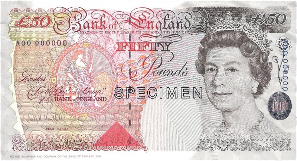
Below is the British note for the worth of £50.  Its design is very elegant and intricate. The note portrays an image of the monarch on the front of the note, therefore the note must be presented in an elegant and professional manner as it's representing the queen’s reputation and influential status. Anything else apart from elegance could damage the portrayal of the Queen and her monarch. Elegant script typeface again represents an elegant and sophisticated style.


The American dollar is very consistent all the way through its paper notes. They all consist of the pale-washed green with a dark grey or green to add depth and visual appeal to the design. There’s no explanation to why the colour of the note is green, one answer could’ve been that the pigment of that colour was readily available in large amount at that time. It praised for its resistance to chemical and physical changed. This demonstrates the importance of security but also cost efficient methods of printing money in 1929. The aesthetics of the design isn't as sophisticated as the UK note a lot of features remain the same. The layout and hierarchy of information is very identical with the amount in the corners of the note while a historic figure has been used to embed a sign of American patriarchy. Slab serif typeface communicates legibility/readability, strength and boldness — connotations and traits that make the US and its currency unbreakable and strong.


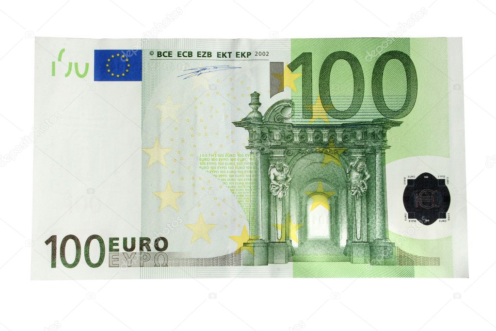
The Euro bank note hasn't been around for as long as the British pound and the American Dollar. The circulation of the Euro was introduced in 2002 and rapidly the currency spread across the Euro zone. As the Currency is new its design is evident of a note designed within the 21st century. Unlike the previous two notes the style and aesthetics is more contemporary and modern, It demonstrates a note that is minimal with the removal of all intricate detailed patterns. Instead of historic figures the Euro note uses Iconic landmarks across the Euro zone. By using Landmark the Euro becomes unbiased towards many countries it represents but instead celebrates all countries of the Euro zone. The landmarks are portrayed within an illustrative style again to communicate a currency that is intact with a modern world and off a timeless design to be used for many generations to come. 


Contemporary Banknotes

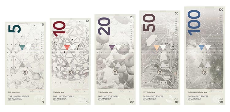
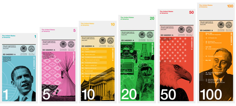
There are often many designs of contemporary banknotes. Even though many of these aren't actual banknotes of any country they do demonstrate how banknotes can be modernised and made to suit a contemporary and contextual currency. All currency designs below showcase a uniform demonstration of how a number of bank notes can work together to form a consistent and recognisable bank note by the implementation of important figures and colours. It appears the trend with banknotes is to have a visual that predominantly takes up most of the bank note and then with a colour overlay that separates each note from the selection of notes but still recognisably in terms of a collection.


This blog post hasn't covered much in terms of coins and that is because coins are relatively the same across all global currency the only different is the design embedded within it. Each coin will have a different design to reflect that particular country. 

The British pound coins excellently demonstrated currency as a piece of collectors item. Currency can some time be considered boring and dull. For special occasions the Royal mint produces a set off coins that are collectables. In the image below all the coins within the currency all form a part of a shield when place together. This showcases how design can be off central focus and not only seen as forced or lifeless. It makes the currency more appealable and potential increase demand for the currency because of the public and collectors wanting to find all parts of the shield. If the demand increases then this can positively impact the economy as more people are buying goods to try and collect all parts of the shield.


Studio Brief 1 - Bauhaus Movement Overview CAN POST

The Bauhaus was founded in1919 in Germany within the city of Weimar. It was founded by Walter Gropius. The main objects of Bauhaus was radical concept, to reflect the unity of the arts by reimagining the material world. The Bauhaus was a combination of crafts and arts from a range of disciplines from painting, sculpture, metal work, pottery, textiles, architecture, product design, graphic design & typography. It was a concept was seen as something completely new back in the early 20th century. The movement existed from 1919 to 1933 due to the elected Nazi party shutting down the school. Today the world considers it to be the hub of avant-guard of modern style and aesthetics in all fields of art and design. The movement can still be visible in today in the Swedish furniture store IKEA.

Walter Gropius saw the school as a 'building of the future' that combined every discipline in the arts and crafts as the Bauhaus motte expressed " Let us strive for, conceive and create the new building of the future that will unite every discipline, architecture and sculpture and painting, and which will one day rise heavenwards from the million hands of craftsmen as a clear symbol of a new belief to come."


Monday, 16 May 2016

Studio Brief 1 - Security Of Money CAN POST

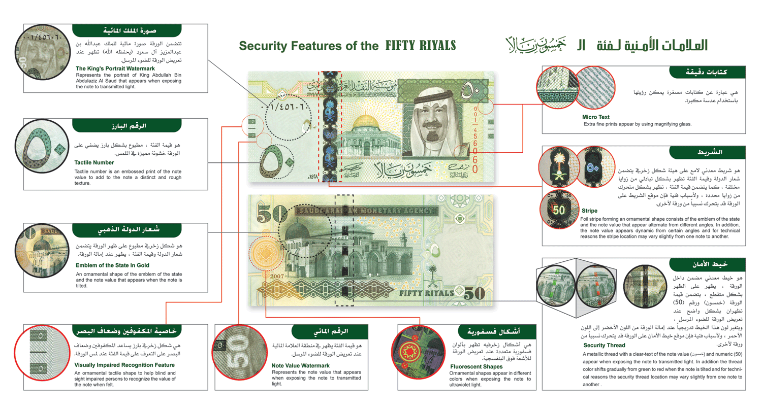
With 1 note in 5000 being fake and Bank of England revealing that there are 566,000 counterfeit notes in the UK, counterfeiting money is one of the oldest crimes in history. In the 19th century it became a huge problem when banks produced their own currency. In this period of the civil war it was estimated that one-third of all currency in circular was counterfeit. With every day technology is advancing and in the 21st century, tough measures are being placed on the production of bank notes to ensure the security of currency is impenetrable. On the surface of most bank notes it's evident to see that by the texture and different print finishes that the security features have been firmly implemented but understanding how they're produced is kept a secret from the public for obvious reasons. 

Questions would be asked about how long paper notes can be secured for until technology is advanced enough where keeping notes secure is no long viable. The security aspect of paper notes are personally the only reason left to why paper notes are still widely used today. Digital currency is taking over which seems like a safer and hassle free way of stopping counterfeiting due to finger print security options that become impossible to break. However digital currency is often subject to hackers and cyber crimes by fraudsters tapping into the contactless feature of credit cards. 

Lastly, when does the security features ruin the aesthetics and design of the card? If paper notes become more secured then the whole style and aesthetics of the bank note will become overpowered and busy — clashing with colours and images just for the sake of security. Security is crucial for the future of paper notes but if the security features take over then the bank notes no longer become a bank note. The whole structure and build of a bank note would essentially need to be redesigned to insure maximum security is off the highest priority with little input from design aesthetics or style.

Below are three images that demonstrate how many security features on one note. It opens your eyes to the lengths banks go to in order to secure and get one step ahead of criminals.