Current global banknotes
The design style and aesthetics of a bank note is normally influenced by the currencies history within that particular country. Therefore, no two currencies are the same and each country has their own unique take on their legal tender from paper notes to coins. The only feature that remains relatively the same is the shape and size of a paper note and coin. They still differ in size but generally all are very similar. As a set bank notes normally differ in sizes to communicate to the user that some notes are worth more or less than others. For example, British notes range from £5, £10, £20 and £50, the £5 note is the smallest not and the £50 the biggest. There’re also colour coded for extra confirmation. It makes the notes relatively easy to understand a certain value of that note. They help people who are foreigners, on holiday and for people with visually impaired disabilities. It's a global trend with currency such the Euro, Uk, Australian Dollar, Zloty and many more producing notes with different sizes to reflect the worth. It helps with global tourism to instil confidence into foreigners as money can be confusing to understand if used for the first time. However, some countries do not such as the American Dollar and the Rupee.
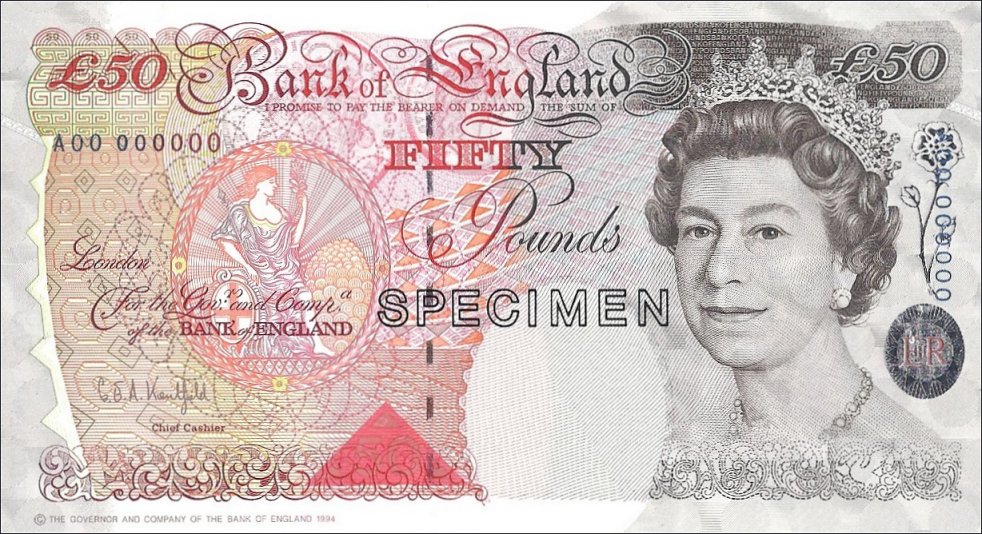
Below is the British note for the worth of £50. Its design is very elegant and intricate. The note portrays an image of the monarch on the front of the note, therefore the note must be presented in an elegant and professional manner as it's representing the queen’s reputation and influential status. Anything else apart from elegance could damage the portrayal of the Queen and her monarch. Elegant script typeface again represents an elegant and sophisticated style.
The American dollar is very consistent all the way through its paper notes. They all consist of the pale-washed green with a dark grey or green to add depth and visual appeal to the design. There’s no explanation to why the colour of the note is green, one answer could’ve been that the pigment of that colour was readily available in large amount at that time. It praised for its resistance to chemical and physical changed. This demonstrates the importance of security but also cost efficient methods of printing money in 1929. The aesthetics of the design isn't as sophisticated as the UK note a lot of features remain the same. The layout and hierarchy of information is very identical with the amount in the corners of the note while a historic figure has been used to embed a sign of American patriarchy. Slab serif typeface communicates legibility/readability, strength and boldness — connotations and traits that make the US and its currency unbreakable and strong.
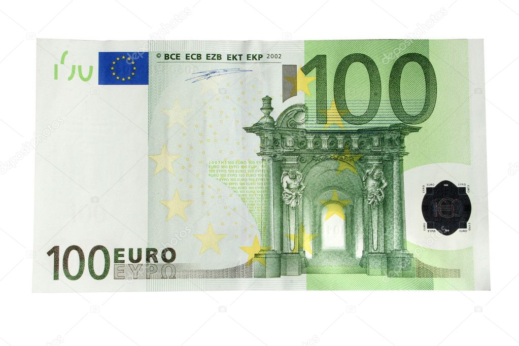
The Euro bank note hasn't been around for as long as the British pound and the American Dollar. The circulation of the Euro was introduced in 2002 and rapidly the currency spread across the Euro zone. As the Currency is new its design is evident of a note designed within the 21st century. Unlike the previous two notes the style and aesthetics is more contemporary and modern, It demonstrates a note that is minimal with the removal of all intricate detailed patterns. Instead of historic figures the Euro note uses Iconic landmarks across the Euro zone. By using Landmark the Euro becomes unbiased towards many countries it represents but instead celebrates all countries of the Euro zone. The landmarks are portrayed within an illustrative style again to communicate a currency that is intact with a modern world and off a timeless design to be used for many generations to come.
Contemporary Banknotes
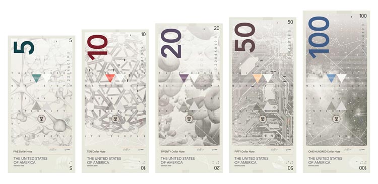
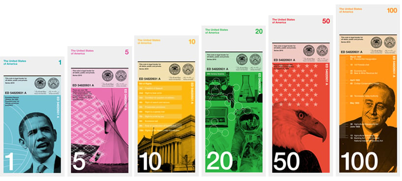
There are often many designs of contemporary banknotes. Even though many of these aren't actual banknotes of any country they do demonstrate how banknotes can be modernised and made to suit a contemporary and contextual currency. All currency designs below showcase a uniform demonstration of how a number of bank notes can work together to form a consistent and recognisable bank note by the implementation of important figures and colours. It appears the trend with banknotes is to have a visual that predominantly takes up most of the bank note and then with a colour overlay that separates each note from the selection of notes but still recognisably in terms of a collection.
This blog post hasn't covered much in terms of coins and that is because coins are relatively the same across all global currency the only different is the design embedded within it. Each coin will have a different design to reflect that particular country.
The British pound coins excellently demonstrated currency as a piece of collectors item. Currency can some time be considered boring and dull. For special occasions the Royal mint produces a set off coins that are collectables. In the image below all the coins within the currency all form a part of a shield when place together. This showcases how design can be off central focus and not only seen as forced or lifeless. It makes the currency more appealable and potential increase demand for the currency because of the public and collectors wanting to find all parts of the shield. If the demand increases then this can positively impact the economy as more people are buying goods to try and collect all parts of the shield.


No comments:
Post a Comment