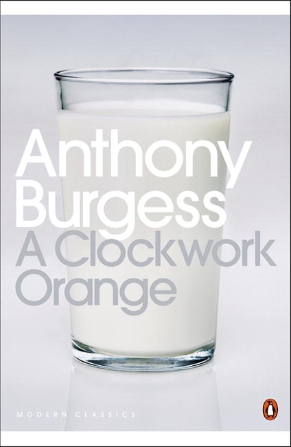
For the Penguin book brief I decided to choose the 'A Clockwork Orange' book. I felt it was important to start looking at past examples of the book as It's been around since the 1970's, therefore the book cover has seen many different variations over the years, so taking a look at these should give me a good example of what i should be looking into and hopefully find a concept that hasn't been done before.
 |
| This book cover is probably the most famous book cover from Clockwork Orange. The book cover has been design under the guidelines of Penguin. The layout is very stripped back, leaving a lot to the readers imagination. It's almost teases the audience to pick it up and see what the book is about as the book it's self doesn't give anything away. The way the book has been designed, suggests that It may be aimed at a specific audience. By having a stripped back layout and aesthetic the book comes across more upmarket and aimed at an older demographic. |
 |
| Very different style to any other Clockwork Orange book cover I've seen. This cover demonstrates it's emotional psychological side of the book. The style of the illustration used will appeal to a younger demographic as the illustration almost looks comic bookish. This may put off other audiences from picking up the book as it may give off a false impression of the content inside the book. The colour links back to the title and the typeface again only strengthens the impression of a comic book theme which isn't suited for the book. |
 |
| A more modernist approach to the Clockwork orange book then the others. Simply using the symbol of an orange to represent the book in a literal term. It may not say anything about the book but any user who knows the book would easily recognise the book cover and that's because the book has become renowned for the orange symbol. Therefore, this book cover works in a modern aesthetic. The circle will be a visual sign that shines on a book shelf making it appealing and hard to miss. Typefaces positioned in corners with a small type size increase white space and gives the overall look more of an modern appeal. |
 |
| This cover implements a visual image which represents the book in some form. The glass of milk is what Alex's gang drink in Clockwork Orange but to anyone who doesn't read the book they wouldn't have a clue why there was a glass of milk on the cover. This may be seen as a downfall to have a glass of milk on the front cover but it can be seen as a positive, it could be used to gain the readers interest to wonder why there is a glass of milk on the front cover. Typography is a modern san-serif font to give the overall cover a modern aesthetic and representing readability ad boldness that can make the design visually strong from long distance away. |
No comments:
Post a Comment